Four Types Of Composition
Composition is the arrangement of shapes or forms in an image, their position, relationship to one another and to the image as a whole. Photographers compose their images to create certain effects and to affect the viewer. There are four different kinds of composition:
- Rule of thirds
- Balance
- Layers
- Triangles
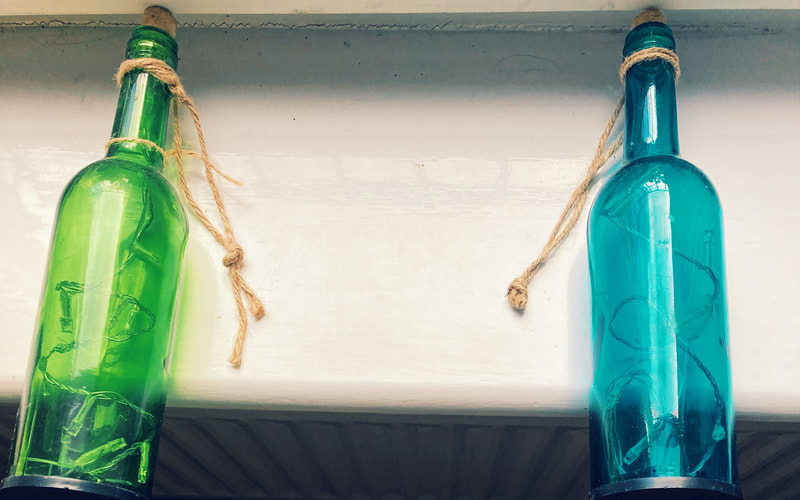
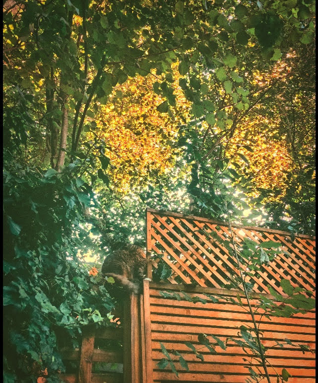
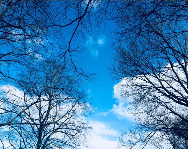
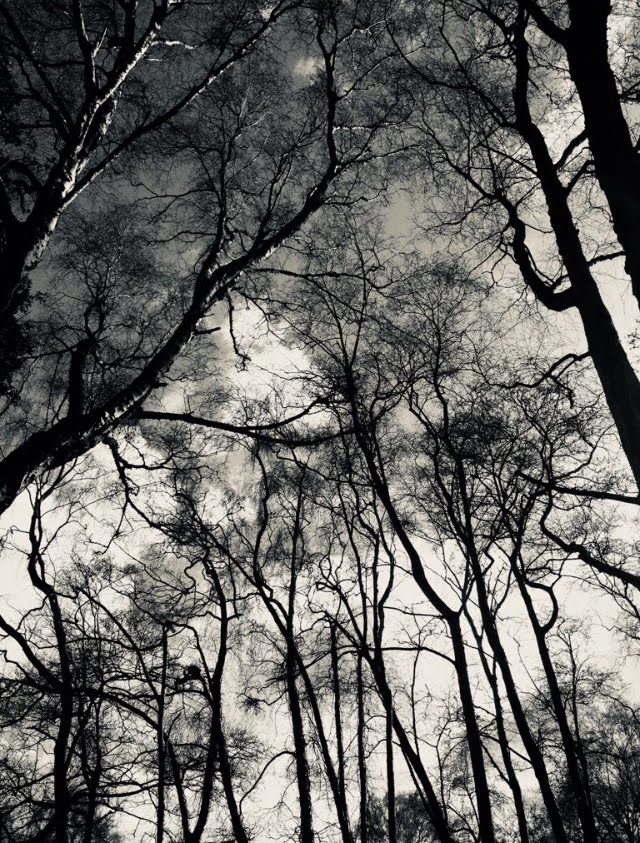
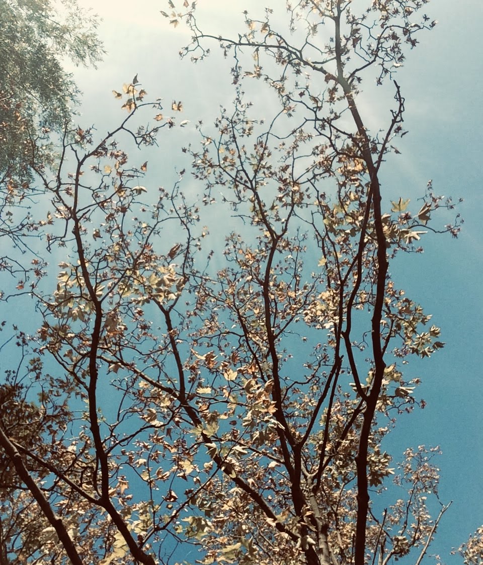
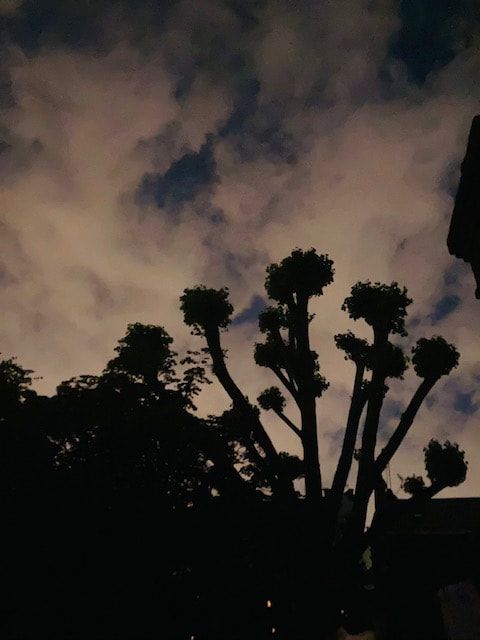
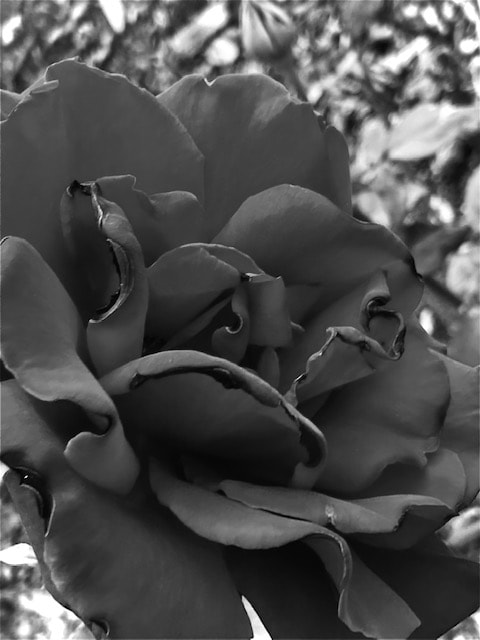
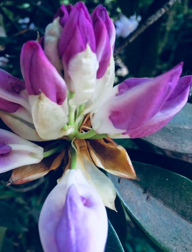
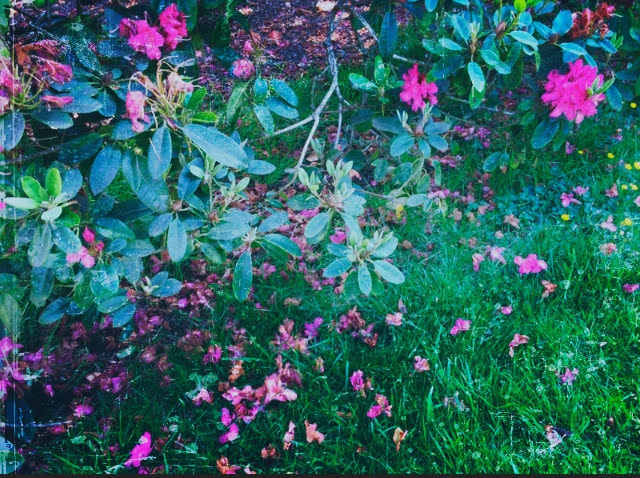
Layers
What Are Layers?
This is overlapping of two objects over each other including the area covered by another photograph
What Are Some Examples Of Layers?


Layers: My Response (Unedited + Edited)
Edited
Unedited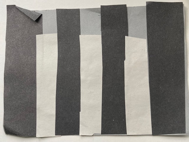
|

|
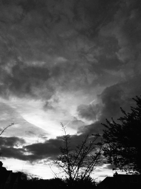
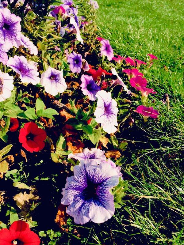
Rule Of Thirds
What Is The Rule Of Thirds?
The rule of third describes a compositional structure of a photograph. It's a grid that breaks images up into thirds and are commonly used in landscapes. It's done by dividing equal segments into vertical and horizontal lines. The purpose is to draw viewers eyes into the subject of the photo and make it stand out more.
What Are Some Examples Of Rule of Thirds?


Rule Of Thirds: My Response (Unedited + Edited)
Edited
Unedited
|

|
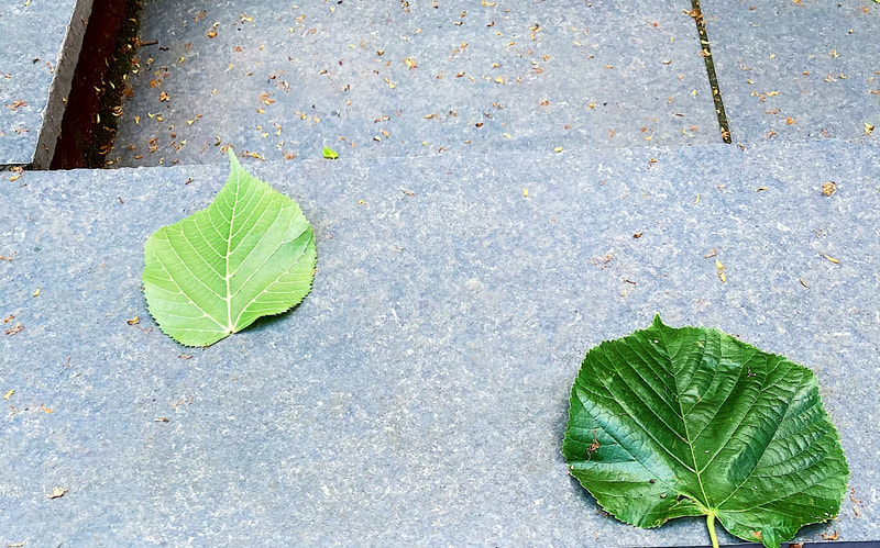
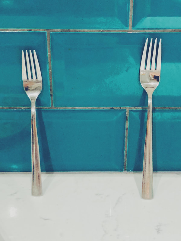
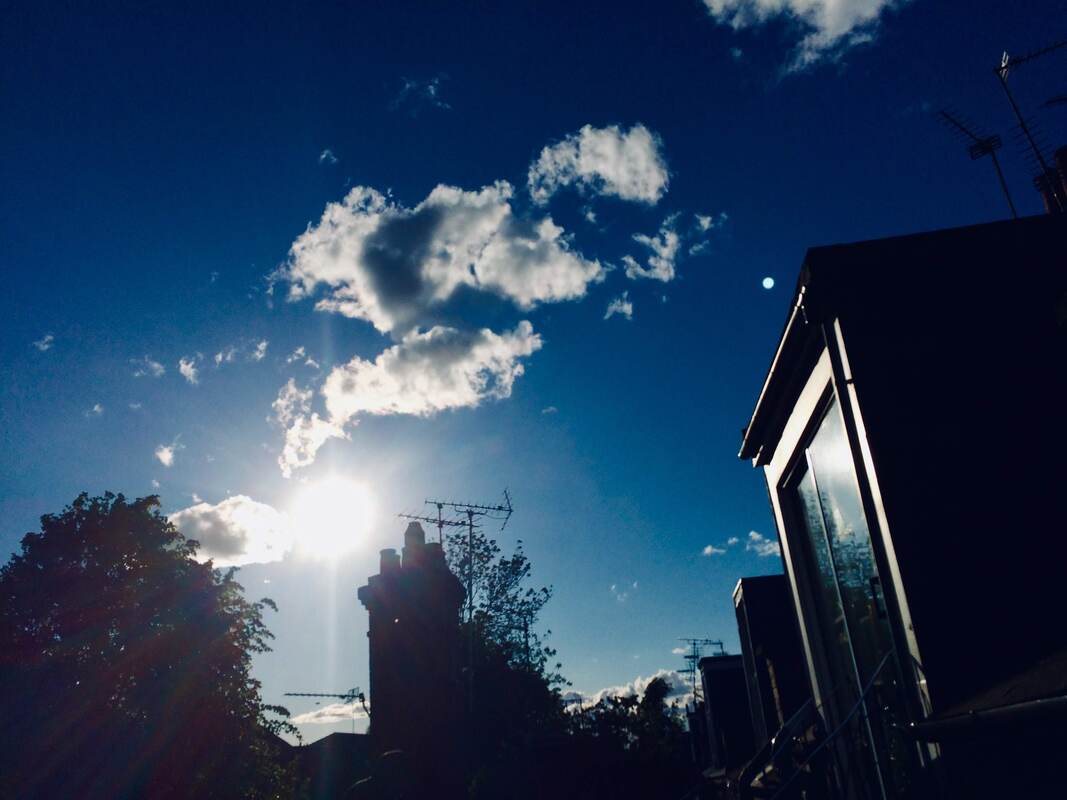
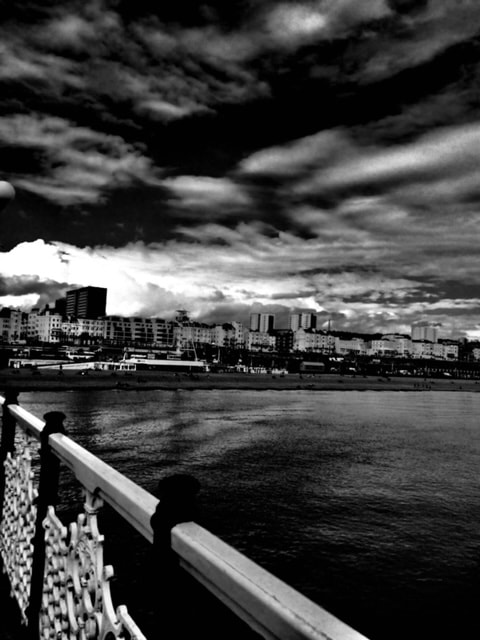
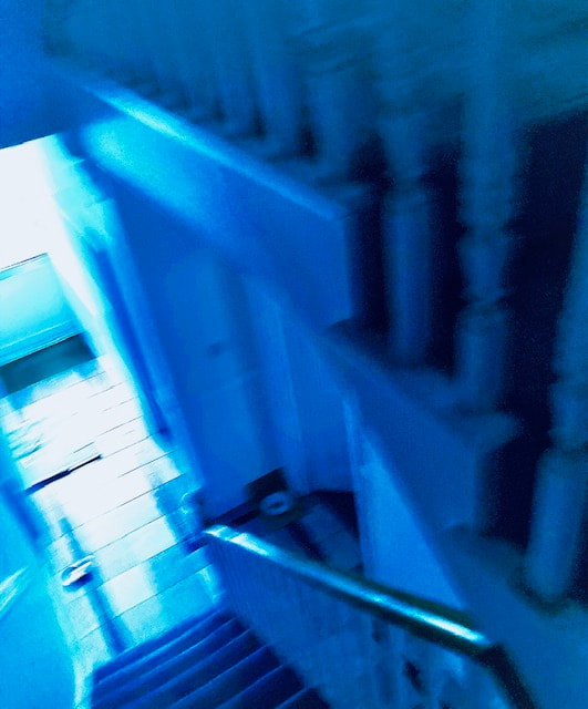
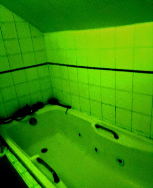
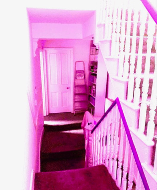
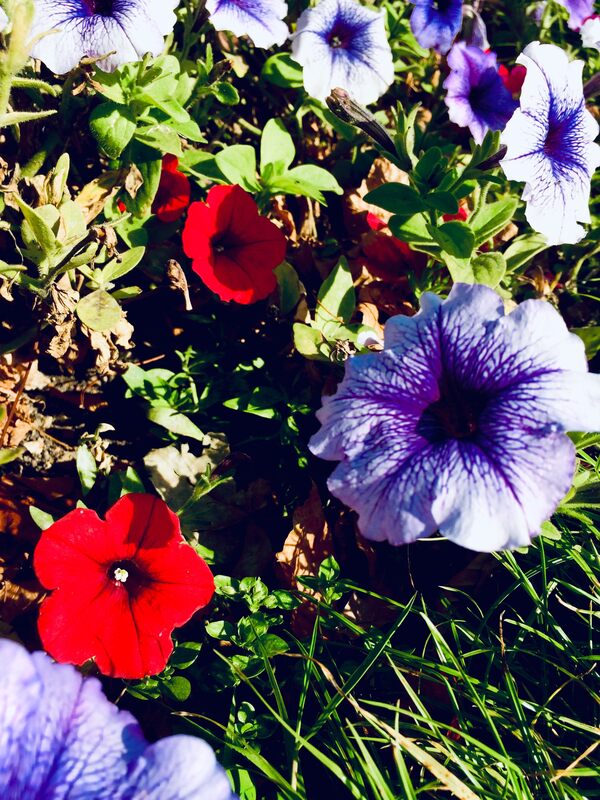
Balance
What Is Balance?
Balance is a technique used in photography to create a more eye catching photo. By balancing pictures the tones, colours and objects are of equal visual height
What Are Some Examples Of Balance?


Balance: My Response (Unedited + Edited)
Unedited
|
Edited
|
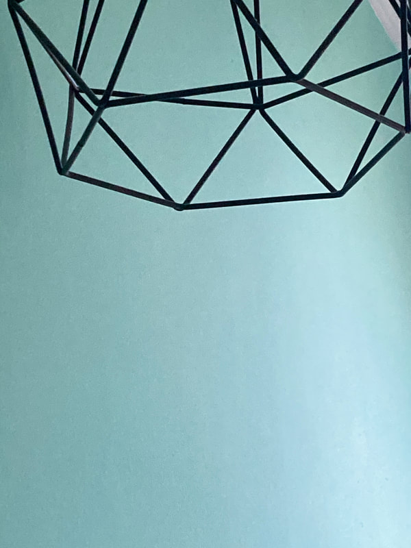
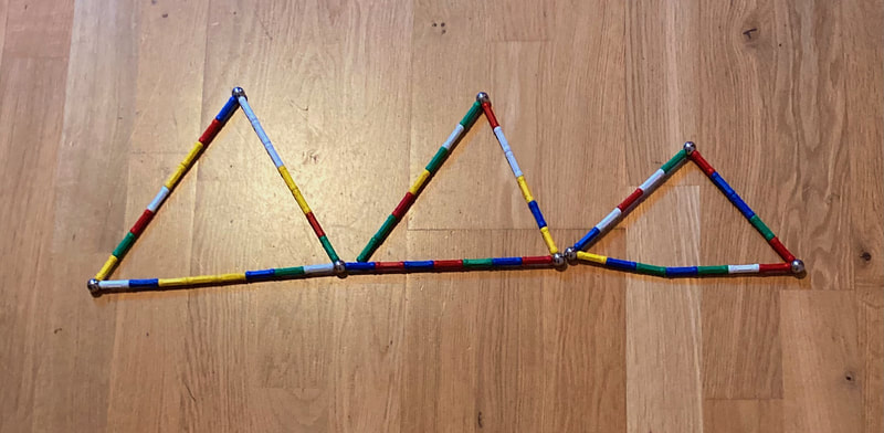
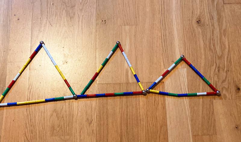
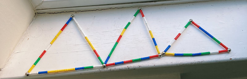
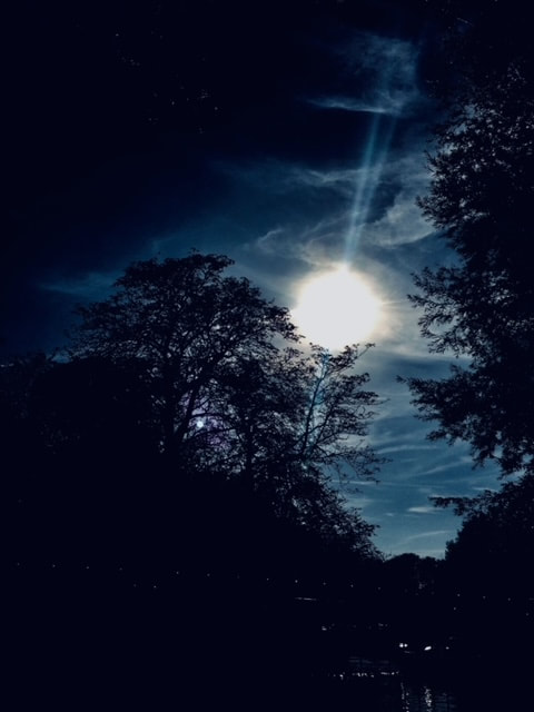
Triangles
What Are Triangles?
Triangles are a way of grouping three points of a photograph and arranging them in a way that creates a feeling of stability, aggression, instability, etc. It enhances a feeling of strength and grasps the subject of your photo better. They are best for stable compositions:
What Are Some Examples Of Triangles?


Triangles: My Response (Unedited + Edited)
Unedited
|
Edited
|
Task
Take photos that show the above compositions in real life
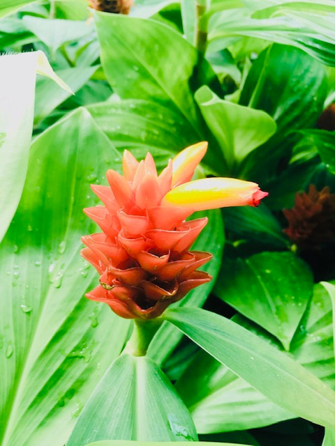
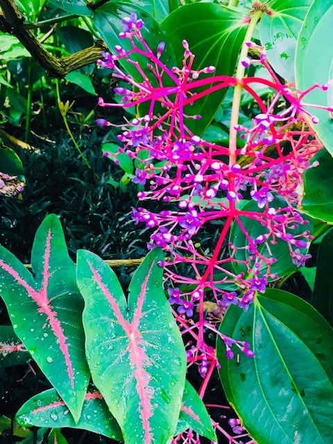
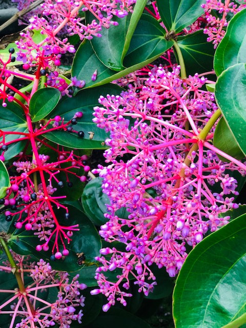
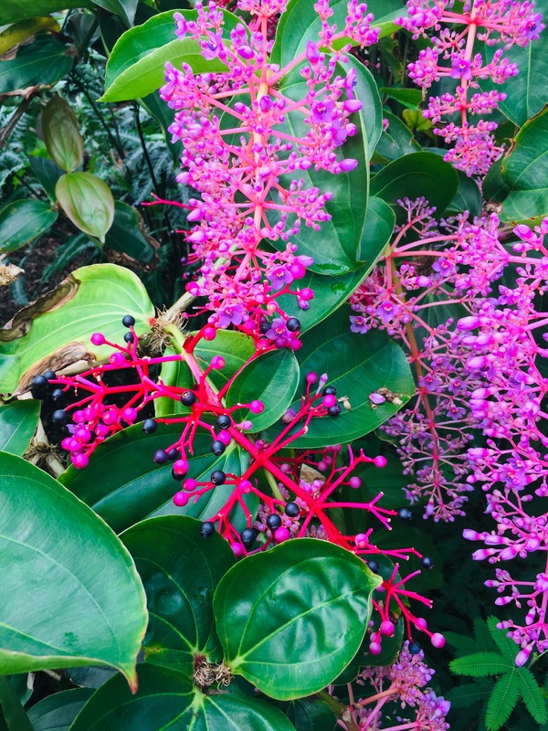
Layers: My Response


|

|
Rule Of Thirds: My Response
|
|
Balance: My Response
|
|
Triangles: My Response

|

|
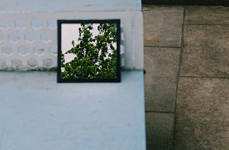
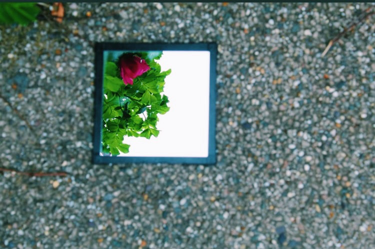
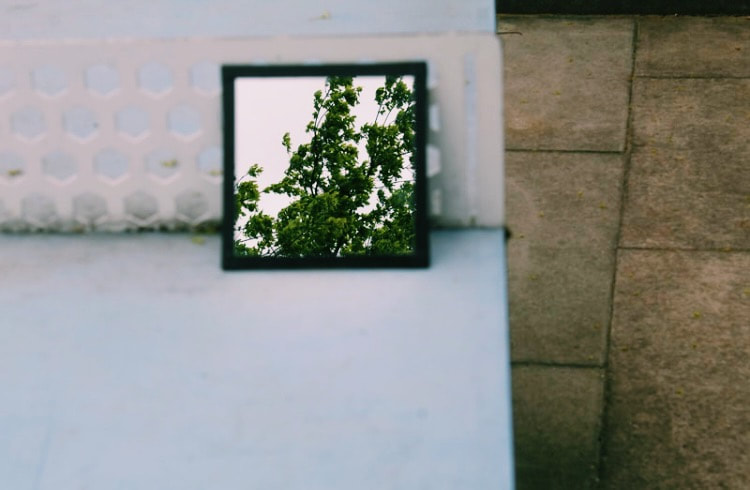
Sebastian Magnani
Sebastian Magnani is a portraitist and visual artist that pursued his dream career of photography. He had many viral projects that influenced the success of his photography for example Underdogs and Undercats which gained significant media attention. His work 'reflections' is produced by placing a mirror on the ground, capturing the reflection of the sky and highlighting different textures, patterns and colours as earth and sky come full circle in a single image. Here is some of his work:
Sebastian Magnani's Photo's

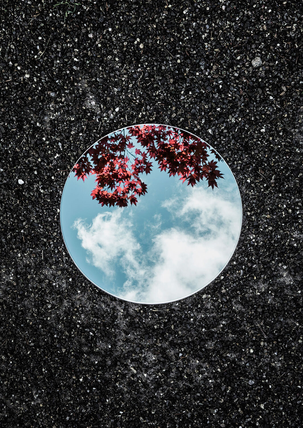

What Were Sebastian Magnani's Intentions?
Sebastian Magnani had the intention of creating two landscapes at once, for example the ground below and the sky above. For example in his piece 'Reflections' he combines man made surfaces like asphalt with nature like branches and leaves. The use of this contrast allows the viewer to focus on the textures, patterns and shapes of the environment. Using the circular mirror also creates an illusion for some images like the night sky which looks like a full moon through the deception of the mirror.
"The great thing about the mirrored mild is it's like a universe, a small planet, with a number of risks in distinction of buildings, colours, moods and numerous lightings"
What Wider Context Was Sebastian Magnani Addressing?
I believe Magnani wanted us to focus on the specific details in nature and look at the world from a different angle, through the different perspective he allows you to see a whole landscape in one image, looking at the ground and the sky. It lets you see your every day surroundings in a different way and I think he wanted to convey scenes of every day life in a artistic way.
How Does Sebastian Magnani's Style Of Photohgraphy Support His Intentions?
The use of natural light instead of artificial light makes his images more real and relevant to his theme of the natural environment. Most of his images in the centre of them have vibrant blues, greens and yellows. This supports his theme of earthly, nature centered images.
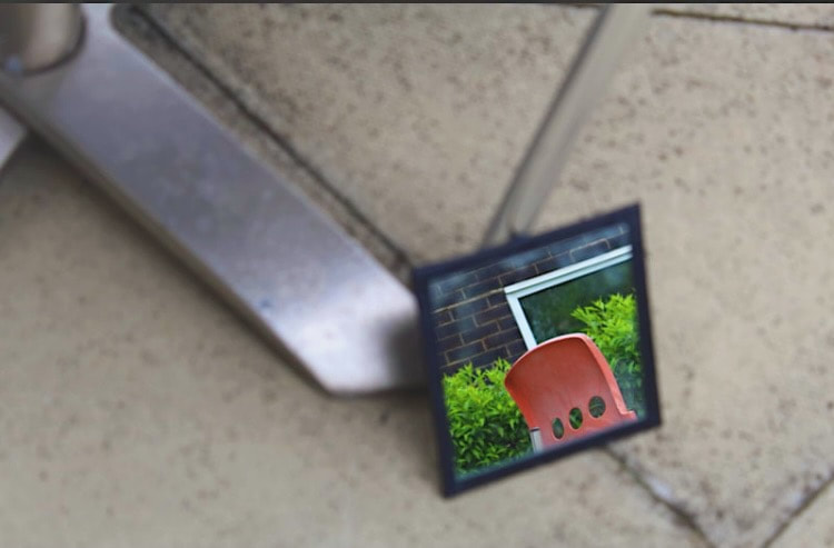
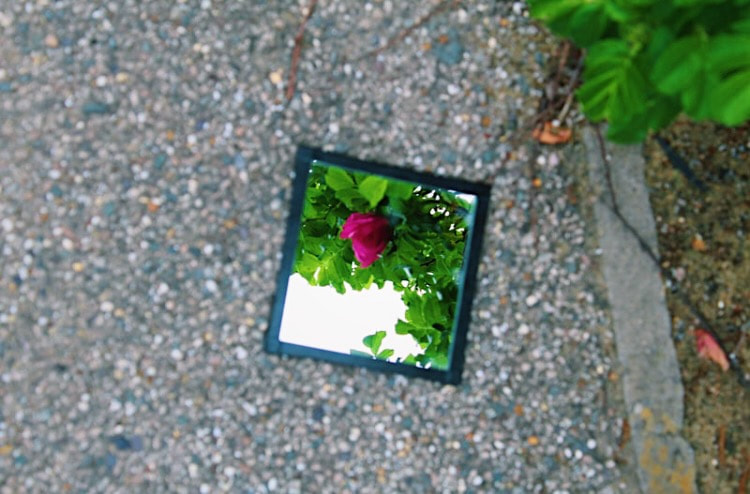
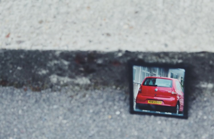
Sebastian Magnani: My Response (Unedited)
What Will I Need For This Photoshoot?
- A mirror
- To go outside for scenes of nature for instance trees and flowers
- A camera
- Good lighting
- A surface to balance the mirror against
Sebastian Magnani: My Response (Edited)
|
|
What Went Well + Even Better If
WWW: I like that these photos have good lighting and I managed to include lots of different objects with different sizes, shapes and appearance in the mirror reflection
EBI: To improve my pictures I would use more nature in my pictures and experiment with higher up like the sky or clouds
EBI: To improve my pictures I would use more nature in my pictures and experiment with higher up like the sky or clouds
What Compositional Techniques Have Been Used?
Rule Of Thirds: Has been applied to some images of the car
Balance: Has been used occasionally
Triangles: Has not been used in this photoshoot
Layering: Not used in this photoshoot
Balance: Has been used occasionally
Triangles: Has not been used in this photoshoot
Layering: Not used in this photoshoot
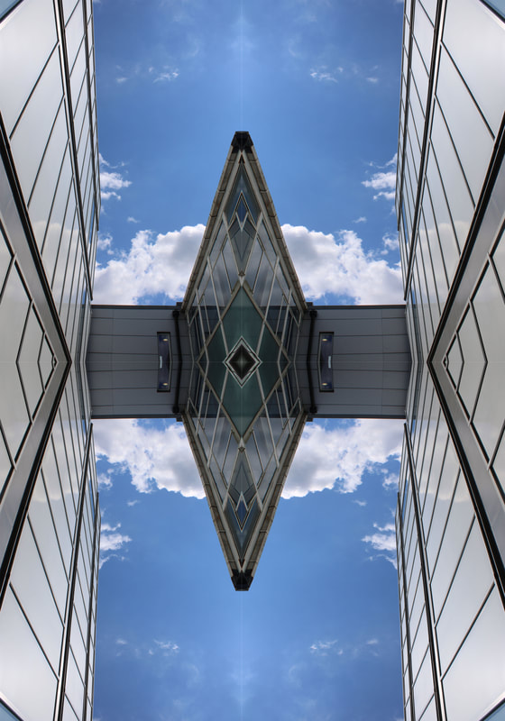
Andy Yueng
Andy Yueng is a landscape, architectural and Ariel photographer. Born and raised in Hong Kong, he took inspiration from his city, which influenced his later works. His motto is to 'always look up' which is a reflection of his focus on ariel photography and capturing modern buildings and constructions. When he first got a camera in 2005 he exchanged it for a drone to give better insight to all angles of the buildings. One of his most recognised works of Ariel photography includes the 'urban jungle' series that attracted international attention. Andy has worked with several newspapers and other companies such as BBC and CNN.
What Were Andy Yueng's Intentions?
Andy's serial images of Northern Hong Kong were made to reveal the characteristic verticality of Hong Kong's urbanism. He potrays this by focusing out and taking wide shots of the landscape from afar to capture the beauty of Hong Kong's views from afar.
"Capturing great moments and transforming what I've seen into something new and artistic is a rewarding experience"
What Wider Context Was Andy Yueng Addressing?
Andy Yueng learned to cull inspiration from his experiences being born and raised in Hong Kong, the artist found a passion for aerial photography in particular. He found a love for his photography through his connection with his city and being inspired enough to turn it into a career.
How Does Andy Yueng's Style Of Photography Support His Intentions?
I think the imagery of tall buildings and the way the photographer has showed the image from high above or looking upwards from the ground allows you to fully appreciate the vastness of the picture and city. His intention was to create visuals that are eye catching and make you appreciate the beauty of Hong Kong, and taking photos from angles that capture everything helps this. Furthermore the bright colours and attention to detail is displayed in the skies and buildings creating a futuristic modern feel. He showcases urban life to be a magical and electrifying scenery.
Andy Yueng's Photo's


Task
Take pictures of buildings and photoshop them to mirror each other
What Will I Need For This Photoshoot?
- Buildings at school
- Good lighting that's not too overexposed from the sun
- A camera
- To edit on Photoshop after the pictures have been taken
Andy Yueng: My Response (Unedited)
Andy Yueng: My Response (Edited)

What Went Well + Even Better If
WWW: Good mirroring on both pictures
EBI: Variety of buildings to create more diversity of photos, next time I would choose to takle pictures that aren't just from looking upwards but also below
EBI: Variety of buildings to create more diversity of photos, next time I would choose to takle pictures that aren't just from looking upwards but also below
What Compositional Techniques Have Been Used?
- Balance: Each picture is meant to be equal in balance as I've duplicated the image on photoshop
- Rule Of Thirds: Has not been used in this photoshoot
- Layering: The pictures have been duplicated but not layered
- Triangles: There is some use of triangles in the edited pictures
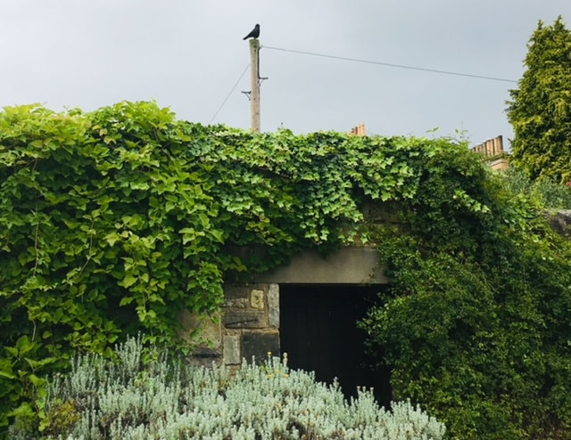
Romain Jacquet-Lagreze
Romain Jacquet-Lagreze is a French photographer based in Hong Kong, focused mainly on documenting different aspects of the city. I like his style based off the variety in colours, contrast between nature and urban life and the high up and low down perspective of the pictures from the sky and the ground. His photography feels like a balance between futuristic and a look into the past depending on the type of building. Four of his photographic series were published as photo books, these are: Vertical horizon (2012), Wild concrete (2014), The blue moment (2016) and Concrete stories (2018).
Romain Jacquet'-Lagreze's Photo's


What Were Romain Jacquet-Lagreze's Intentions?
In Romain's concrete stories photos, his main intention was to show the different kind of daily scenes and actions rather than individual people that you could recognize. On rooftops he found people smoking cigarettes, he also saw many dogs and children playing.
"I love the way the Concrete Stories shows a full glimpse of Hong Kong in single photos"
What Wider Context Was Romain Jacquet-Lagreze's Addressing?
His first piece 'Vertical Horizon' in 2011 was focusing on the unmatched vertical growth of Hong Kong. The wider context for his other two series ''Wild concrete' which depicts the resilience of the nature in Hong Kong's most popular districts. The other work was called 'The Blue Horizon' and the context for this was focusing on 'fleeing moments' between day and night when the city is caught up in scenes of a deep blue haze.
How Does Romain Jacquet-Lagreze's Style Of Photography Support His Intentions?
The idea of capturing scenes on places like rooftops allows for his photos to be more raw and personal because they're capturing moments of every day life, like hanging washing, playing sports and relaxing with pets as a few examples. Romain said his main goal was to 'record a seldom seen side of people's lifestyle in the older districts of the city, especially in Kowloon which has the biggest density of old buildings' He also explains how ''in Hong Kong, apartments are usually very small and it forces people to adapt and find outside some space for doing what people in other city would do in their garden, on balcony or in parks. this series illustrates the spirit of the city that lies in the resilience of its people and the soul of its old districts.”
What Will I Need For This Photoshoot?
- Plants
- Strong natural lighting
- A camera
Romain Jacquet-Lagreze: My Response (Unedited)
Romain Jacquet-Lagreze: My Response (Edited)


Second Response

|
|
Evaluation: How Have I Developed My Photoshoots?
Compared with my first photoshoot I zoomed out more into looking at buildings in public spaces like parks and streets, I captured more a variety of colours, locations and angles. I think it's improved because there's more variety in scenery and I've refined the photos more. I like that the plants all look unique to each other in the second response and it stands out more than the first that was all taken in a similar location.
What Went Well + Even Better If
WWW: Range of different angles and areas, up close and far. It also captures a lot of detail and has a good use of lighting
EBI: To improve my work I would include more colours and variety in plants
EBI: To improve my work I would include more colours and variety in plants
What Compositional Techniques Have Been Used?
Balance: This has been used in some pictures
Rule Of Thirds: This has been used in only one picture
Triangles: This hasn't been used in this photoshoot
Layering: Sometimes the plants and buildings overlap each other
Rule Of Thirds: This has been used in only one picture
Triangles: This hasn't been used in this photoshoot
Layering: Sometimes the plants and buildings overlap each other
Independent Development:
Elliot Porter
Eliot Porter is an American photographer known for his rich, bold coloured images of the natural world. He is commonly known for his visions of the landscape, focused in woodland areas. From the age of eleven Eliot worked regularly with cameras and pushed his career at Harvard University. The exhibition of his peers like Ansel Adams and Paul Strand encouraged him to take up his career full time, he started with coloured photography and the pictures of birds with a large format camera was the beginning of his many works. In his time this was very advance and separated him from many other photographers and gave him more exposure and fame. As he grew into more popularity his techniques were becoming more clear, the 'dye transfer' process, was a complex, colour print process. He continued his love for photography by travelling globally to places such as Mexico, Glen Canyon, Baja California, Greece, turkey and the Grand Canyon. His work was the subject of many books and portfolio's.
Elliot Porter's Photos


What Were Elliot Porter's Intentions?
Eliot Porter's inspiration came from other nature-based photographers such as Ansel Adams. His main intention was to increase environmental awareness and conversation through his passion for capturing the beauty of the natural world. I believe he wanted us to appreciate and think about how we care for our planet and the ways it can effect nature/animals.
''Photography is a strong tool, a propaganda device, and a weapon for the defence of the environment''
What Wider Context Was Eliot Porter Addressing?
In specific for Porter's pictures of birds he captures the rarest kinds that are bright red and dark blue hummingbirds, the choice of showing birds that you don't typically see in every day life makes the images more distinct and the way he makes them the subject of each photo and focuses on the bird draws more attention to its details and appearance, things we don't notice every day.
How Does Elliot Porter's Style Of Photography Support His Intentions?
Porter used a medium sized tripod and when photographing birds, he used a system of strobe lights. Furthermore, he taught himself black and white camera and darkroom techniques while he was still a teenager. By 1939 he took up colour photography and then learnt Kodak's dye transfer colouring process which gave him control over hues and stable colour prints.
Task
Take 20-30 photographs of your chosen photographer, based off the work of the artist chosen
What Will I Need For This Photoshoot?
- A range of different sunsets and times of the day
- A mixture of lightings and angles
- Natural scenes of nature
- Parks, my garden, other public spaces
Eliot Porter: My Response (Unedited)
Eliot Porter: My Response (Edited)


Second Response
|
|
Evaluation: How Have I Developed My Photoshoots?
Although there's not a drastic difference between the first and second set of photoshoots I've tried including more variety of lightings and catching the trees against the sky at different times of the day and working with sunsets to expand the range of pictures. The night and early morning have been captured a lot in the second photoshoot so that's something I thought worked well.
What Compositional Techniques Have Been Used?
Balance: Some balance has been used but not in most of the pictures
Rule Of Thirds: Only sometimes but again but not in most pictures
Layers: The trees overlapping the background has been featured many times
Triangles: This hasn't been used much
Rule Of Thirds: Only sometimes but again but not in most pictures
Layers: The trees overlapping the background has been featured many times
Triangles: This hasn't been used much
What Went Well + Even Better If
WWW: The mix of different types of weather eg sunny and cloudy. Also the range of different places each picture was taken in and some being more close up and others further away
EBI: In future I would focus less on the pictures of the sky and use different settings to make my photos more different
EBI: In future I would focus less on the pictures of the sky and use different settings to make my photos more different
Clyde Butcher
Clyde Butcher is an American photographer known for his wilderness shots of the landscape in Florida. He originally creates photographs of areas personal to him. He began taking pictures in colours before switching to a black and white theme after the death of his son. During college, Butcher presented his architecture projects by photographing and creating mini scale models instead of drawings. Later, after graduation, he began a career in architecture and worked with many companies. Clyde then moved onto showing his black and white images at local art festivals and pursued a job in landscape photography.
''Only in black and white can I see the design and textures. I don't consider color photography art. Black and white is an interpretation. Colour is a duplication.''
Clyde Butcher's Photos


What Were Clyde Butcher's Intentions?
For solace Clyde turned to black and white photography following after the death of his son, who passed away in a car accident. The photographer later retreated to the wilderness as a form of escapism and tried helping the public understand the beauty of the swamp. I believe his main intention was to find a way of expressing and helping himself after the events of his sons death.
What Wider Context Was Clyde Butcher Addressing?
His photo of the Redwood Forests in California was based off how he used to visit every summer to take pictures of the scenery. After Clyde and his family moved to Florida, he changed his approach from colour to black and white. This inspired him to go back to redwood Forest and retake the pictures. He felt the redwoods enhanced his connection he felt with nature.
How Does Clyde Butcher's Style Of Photography Support His Intentions?
Butcher used the Wet Darkroom technique, base exposure and contrast adjustment to create his photos in woodland areas. Furthermore making prints over 5x9' feet allow the viewer to fully embrace the breadth and scope of the landscape as Butcher experienced it himself. using large film gives a broad landscape to work with.
Task
Take multiple images, both unedited and edited to replicate your chosen artist
*All these photos will have a black and white filter to match with Clyde Butcher's theme, but the edited pictures also have further editing done
What Will I Need For My Photoshoot?
- Nature scenes
- Plants, flowers, skies
- A black and white edit over each image
- A camera
Clyde Butcher: My Response (Unedited)
Clyde Butcher: My Response (Edited)


Second Response
|
|
Evaluation: How have I Developed My Photoshoots?
On the flower picture specifically I tried to develop the photoshoot by using aperture settings and it's around F 2.8. The other pictures aren't very different from the original photoshoot.
What Compositional Techniques Have Been Used?
- Balance: This has occasionally been used in wider pictures where I want to place the subject of the image in the middle and have the background balanced
- Rule Of Thirds: Has not been used much in this photoshoot
- Layers: Has been used when i want to overlap multiple trees over each other
- Triangles: Has not been used in this photoshoot
What Went Well + Even Better If
WWW: I like the range in different blacks and whites that i've used, how some are taken in the night and some during the day and also how some photos are taken in bigger settings like parks while others are just in my garden
EBI: To improve my work I would try and include the river or a pond to make my images more similar to Clyde Butcher's
Catherine Yass
Catherine Yang is an English artist famously known for her wall-mounted lightboxes. Her minimal space style of photography with overly saturated colour in her prints. Catherine uses analouge film and process or cross-processes it producing unexpected bright colours. The familiarily seen white gaps in her photography represents the moment between the two exposures where the camera could not catch, this creates space and time as a disorientated effect pulling you out of the image and shaping different psychological and spatial dimensions.
Catherine Yaas's Photos


What Were Catherine Yass's intentions?
Her aim was to create work that provokes thought, by exploring architecture, space, geography and landscape. From an interview with DACS she said 'our surroundings reflect our surroundings in both our state of mind and sense of ourselves in this world' she explained how it was releveant to the in built environment, which is a 'form of communication, an expression of society' so architecture and the space it occupies and is occupied by, represents social as well as physical structures.
"For each final photograph i'll have shot loads of film. When someone looks at a piece of work, they know something has gone into it, even if they can't lay their finger on what it is'
What Wider Context Was Catherine Yass Addressing?
The use of empty rooms and a distorted blurry effect, she wanted to use different materials and editing to find out what her images could do beyond the limitations of the picture.
How Does Catherine Yass's Style Of Photography Support Her Intentions?
Her 1994 piece titled 'corridors' features luminous blues, greens and yellows as a result of the artists manipulation of photographic film, they depict interior spaces in a hospital. Yaas explained that the negative image makes bright areas blue, so bright or transparent areas get blocked by the blue' she describes empty space left for the viewers to fall into no limit to prevent the viewer from being pulled right in and being pushed out again' Her early 1990's portraits were a series of images for Springfield hospital , a psychiatric institution built in the nineteenth century. Yaas made six portraits of anonymous hospital inmates and staff without visible indication if they were a member of staff or a patient. The photographs were intended as backgrounds to these portraits, and through this she became interested in working with empty spaces as images. It supported her intention to give awareness to mental health, which wasn't commonly spoken of years ago.
Task
Take 10-20 photos to replicate the work of your chosen artist
What Will I Need For This Photoshoot?
- My home
- Experimental colours and lighting
- A camera blur
Catherine Yaas: My Response (Unedited)
Catherine Yass: My Response (Edited)


What Went Well + Even Better If
WWW: Similar colours and minimal spaces used. I also like the blurriness added to some of the pictures that create a more dream-like feel to the images
EBI: To improve these images I would focus on more up close objects like a chair, window or door instead of an entire room or hallway
EBI: To improve these images I would focus on more up close objects like a chair, window or door instead of an entire room or hallway
What Compositional Techniques Have Been Used?
- Balance: Has not been used in this photoshoot
- Rule of thirds has been used in a few pictures
- Triangles: Has not been used in this photoshoot
- Layers: Has not been used in this photoshoot
My Chosen Photographer: Elliot Porter And Why Did I Choose Him?
I enjoy Eliot Porter's work the most because of his vibrant and bright pictures of the natural world, this reflects his passion for environmental issues. He created the foundation for many other famous nature-based photographers and captures the rarest kinds of birds and animals which sets his work apart from other nature photographers. I found it interesting and inspirational that he turned his dream into reality of travelling the world and capturing images globally to find the rarest breeds. Furthermore he developed his 'dye transfer' process that was complex and not regularly used among other photographers. This made his style eye catching and a turning point in photography. His work has also been the subject of many books which shows he's diversified his work into other forms like written books.
Best 6-9 Edits


What Went Well + Even Better If
WWW: I like that my pictures have been taken from different angles including the sky and ground, up close and in the distance. Also the fact that some photos were taken in the early morning, day, evening and night
EBI: To make my work better I would include pictures of ponds or animals and more unique types of nature to make my work more original
EBI: To make my work better I would include pictures of ponds or animals and more unique types of nature to make my work more original
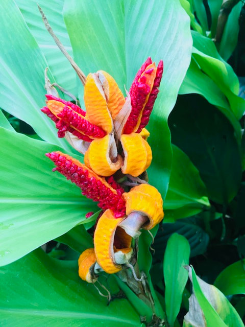
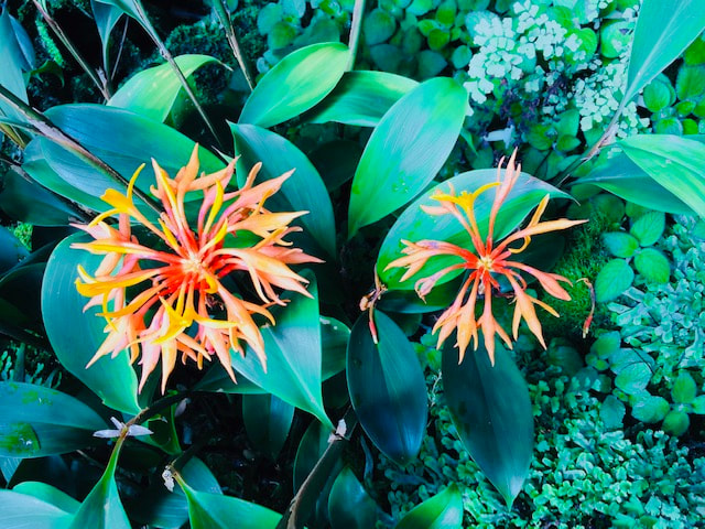
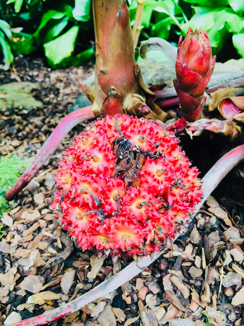
Mika Ninagawa
Mika ninagawa is a contemporary Japanese photographer, known for her brightly saturated up close images of flowers. She mostly focuses on still life, animals and landscapes. The main themes of her pictures focus on Japanese youth culture. Her commercial career in photography took off during fashion shows that she documented as edits for vogue and other magazines and media outlets.
Mika Ninagawa's Photo's


What Were Mika Ninagawa's intentions?
I think Mika's focus on heavily saturated neon colours in nature's aim is to create a dream like vivid affect. Her main intention is to explore Japanese youth culture, lights effect on colour and insight into the world of sea life like goldfish. Her prints also reflect the career she has as a commercial photographer for Japanese fashion publications, for example Vogue.
"For instance, if I'm photographing cherry blossoms, it's as if I'm inside the cherry blossom or I've become the cherry blossom, existing at the boundary between this world and the other world"
What Wider Context Was Mika Ninagawa Addressing?
I believe the wider context of these pictures are to bring people closer to nature and take more notice of the world around them. The surrealism in her pictures blended with the bright colours and lighting could represent a new world of dreams and feelings.
How Does Mika Ninagawa's Style Of Photography Support Her Intentions?
Mika's vibrant aesthetic photos have been influential around the world for portfolio's and music videos. Furthermore her cinematic framing and distinctive style supports her uniqueness and fantasy-like photos.
Task
Take 20-30 photos of flower pictures inspired by Mika Ninagawa
What Will I Need For This Photoshoot?
- Flowers
- Bright colours and lighting
- Going to a park
- A camera
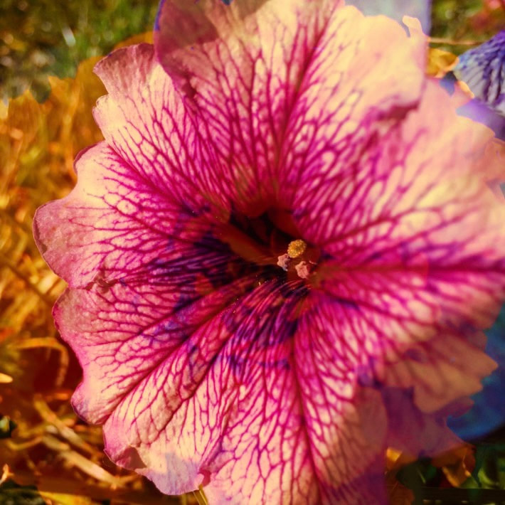
Mika Ninagawa: My response (Unedited)


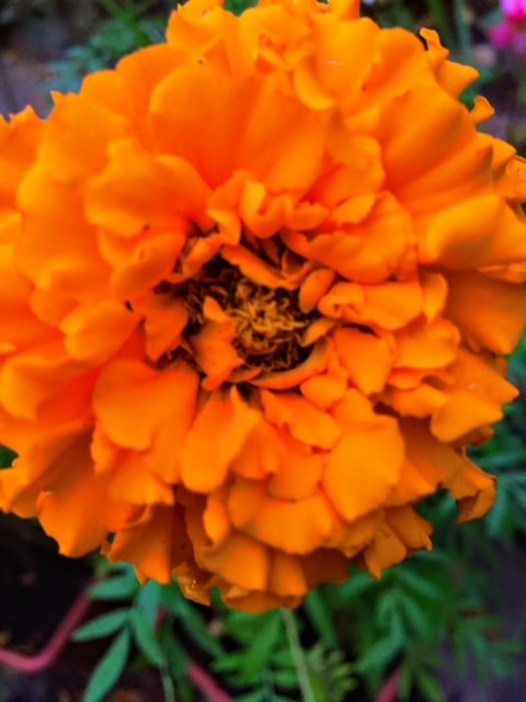


Mika Ninagawa: My Response (Edited)


What Went Well + Even Better If
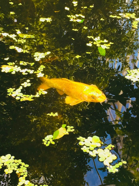
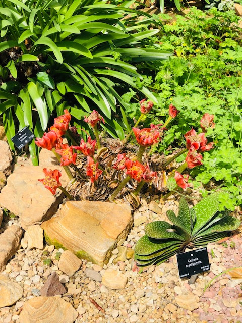
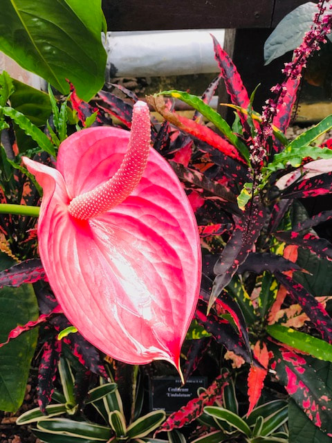
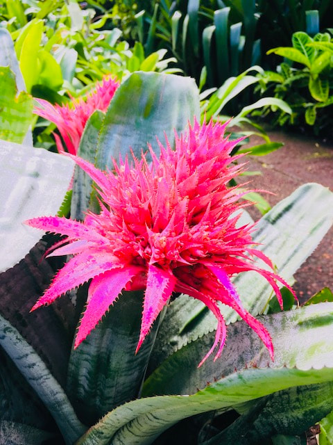
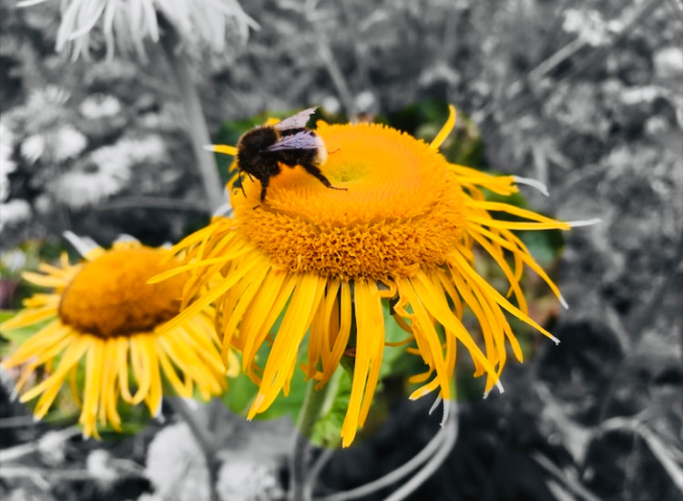
WWW: These are my favourite pictures I've taken, the detail and in depth focus in the plants show many patterns and shapes I'd never seen before. I managed to capture bees on some of the flowers which I feel added more character to the pictures. Mika Ninagawa also photographed a lot of goldfish and I included a picture of one in my photos.
EBI: To improve I would take more pictures from further away that capture the flowers and plants as a group rather than individual flowers. I would also experiment more with different lightings.
EBI: To improve I would take more pictures from further away that capture the flowers and plants as a group rather than individual flowers. I would also experiment more with different lightings.
What Compositional Techniques Have Been Used?
Balance: Balance has been used in some photos where I want the flower to be focused in the middle
Rule Of Thirds: Has not been used much in this photoshoot
Triangles: Has not been used in this photoshoot
Layers: In later developments I will be blending and overlapping all the pictures together as layering but not in this photoshoot
Rule Of Thirds: Has not been used much in this photoshoot
Triangles: Has not been used in this photoshoot
Layers: In later developments I will be blending and overlapping all the pictures together as layering but not in this photoshoot
Next Development
My Next Development Plan
For my next development I want to focus on the patterns and textures of flowers and leaves. To achieve this I want to create colleges and go to places that specifically are attractions for flowers. For example I'll be going to Kew Gardens and photographing the scenes of plants and focusing on the details. My intention in making collages and using other plants as a background for these collages is to create a world of flowers and bright colours, compiling everything I saw and allowing the viewer to see lots of individual plants in a collection. I want these photos to be striking to the eye and give an effect of a floral design. My inspiration for this project will be taken from Elliot Porter and mainly Mika Ninagawa. I enjoy working with nature the most in photography as I feel it allows me to be the most flexible in how I edit and what I can create.
My Development: (Unedited Response)


My Second Development: (Edited Response)
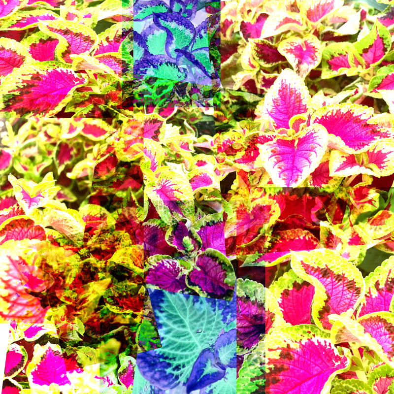
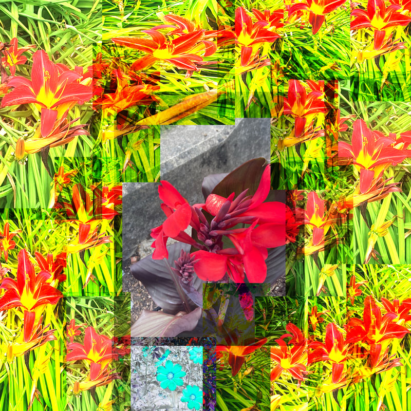
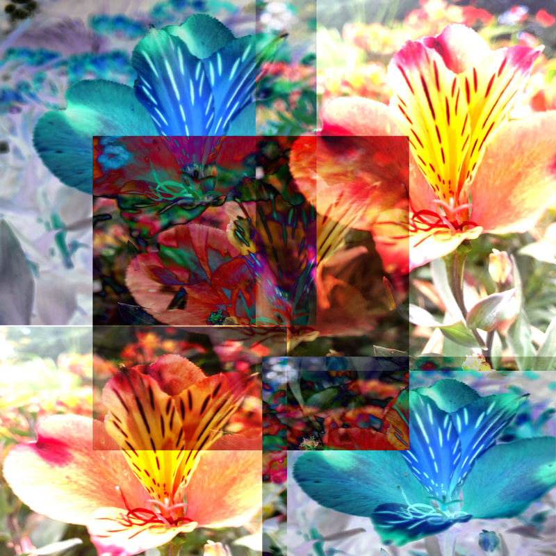
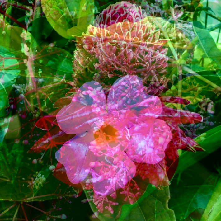
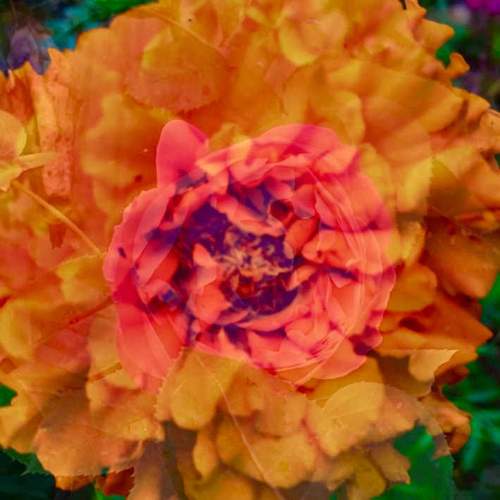
- Image 1: For this picture I compiled some of the brightest images and blended and overlapped them, I also changed the colours so there's blue and pinks and bright greens. Some images have been duplicated and are hidden within other pictures of flowers.

- Image 2: In this picture I created a theme of blues and whites, there are points in the photo the image is darker and others where the layering makes the image very light and white. There is a heavy contrast between the darkness and saturation in some areas, with other regions very bright and fair.
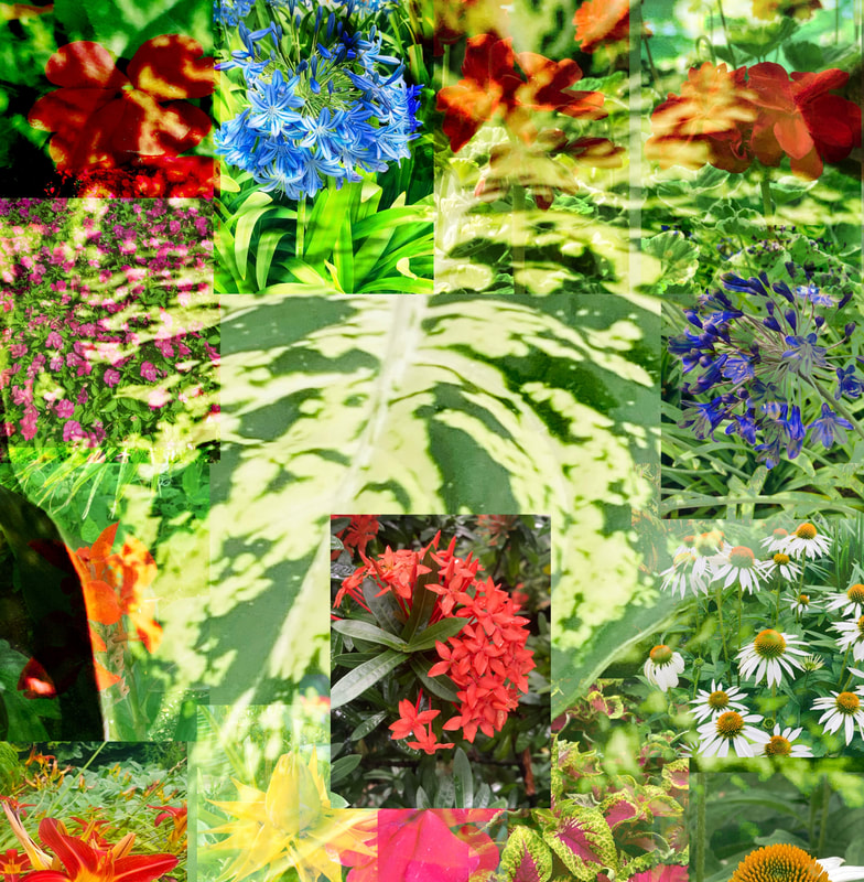
- Image 3: A load of flowers have been merged together, the backdrop of this image was a huge leaf. The texture of it was very glossy, smooth and shiny in comparison to the others I saw in Kew Gardens, and the light streaks running across it helped create a unique background. Some of the flowers are more faded and others are more bold, I wanted to give a dream-like effect.

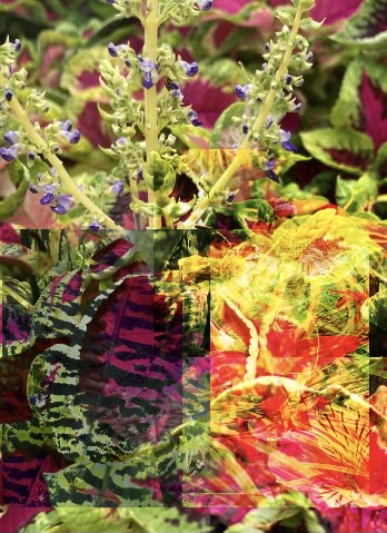
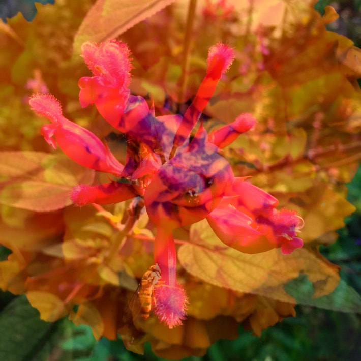
- Image 4: In this picture I firstly captured a bright yellow leaf with pink speckles dotted across it. There is a pink line running through it, and I tried using that line to create a division between red flowers and higher up in the picture yellows and greens. This isn't my favourite picture because it was very difficult to make it look neat and the yellows and greens didn't show up much because the plant was already yellow so it camouflaged in.
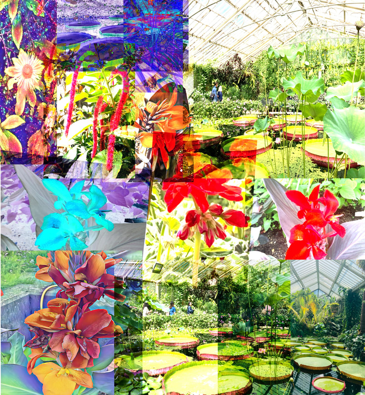
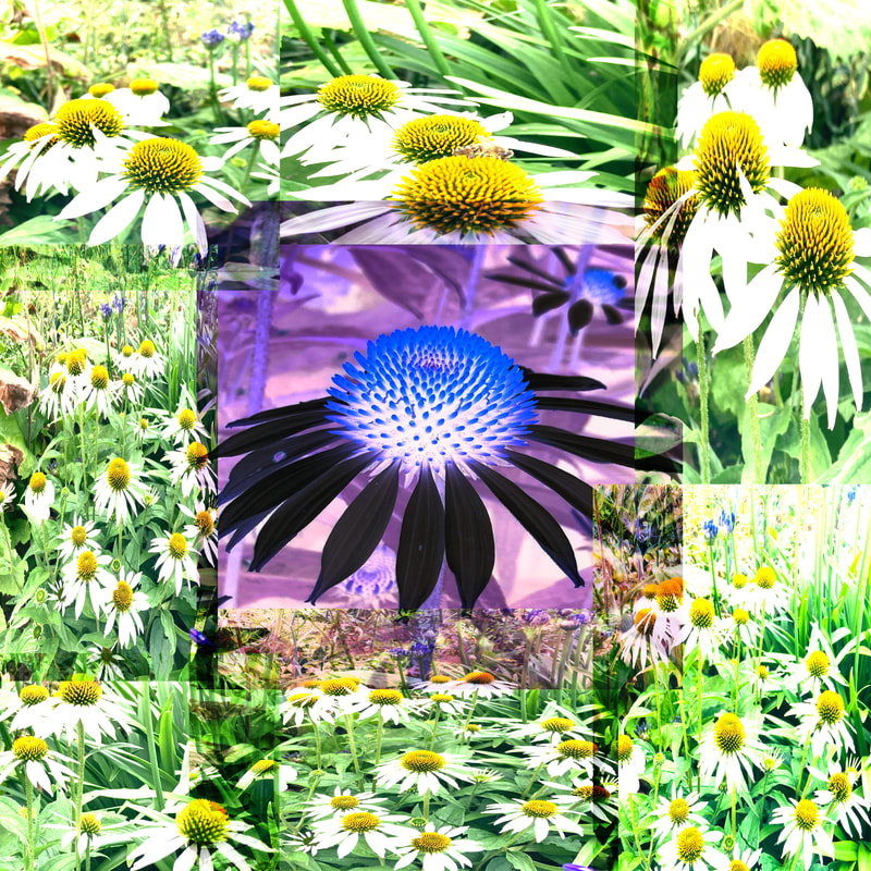
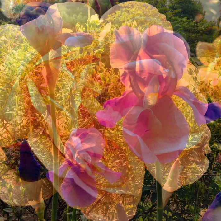
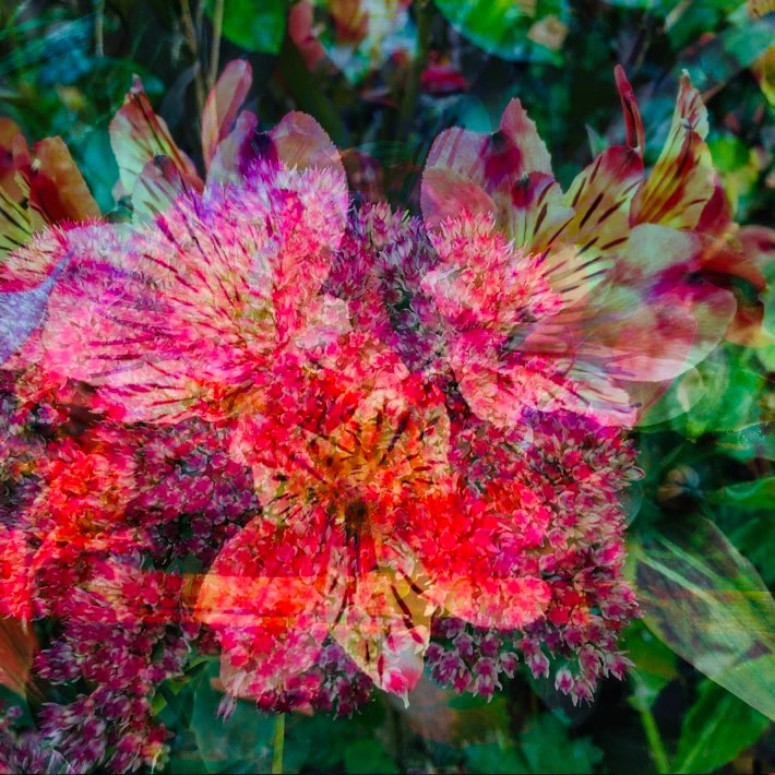
- Image 5: I like this photo because I included different effects on the flowers and captured the lily pads inside the greenhouse which I thought would work against the red in the flower. Towards the left of the picture I included more purples and blues. The overlapping of one image over another makes some of the lily pads darker and others lighter.
- Image 6: For this image I gathered up close images and shots taken from far away. The layering makes some of the flowers appear quite dark, there's mostly pinks and hints of yellow as well. There are more hints of the natural world and nature in this picture with a bumble bee on one of the flowers and people in the distance of the flower display.
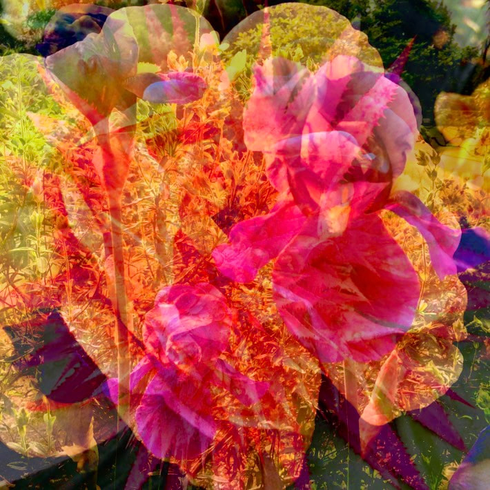
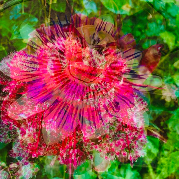
- Image 7: I used a dark flower with a bright red in the centre and duplicated images of the other bright flower which was red and had a lime green stem. For this picture I imagined it to be a design on a wallpaper or item of clothing. I think the bright surrounding flowers contrast well will with the more quiet, subtle flower in the middle.

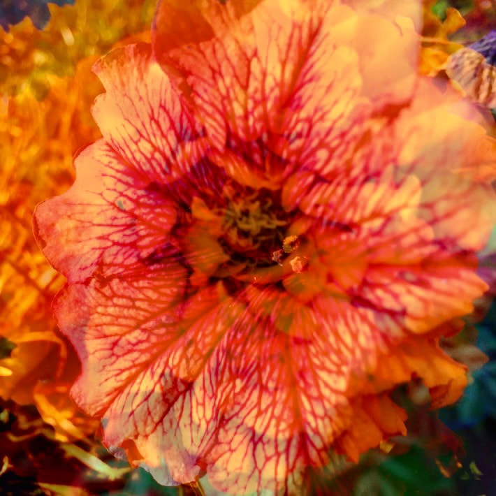
- Image 8: This picture was an attempt at blending about thirty pictures together, I changed the hue of the flowers on the end so they were bright blues and greens. All the flowers were taken up close.
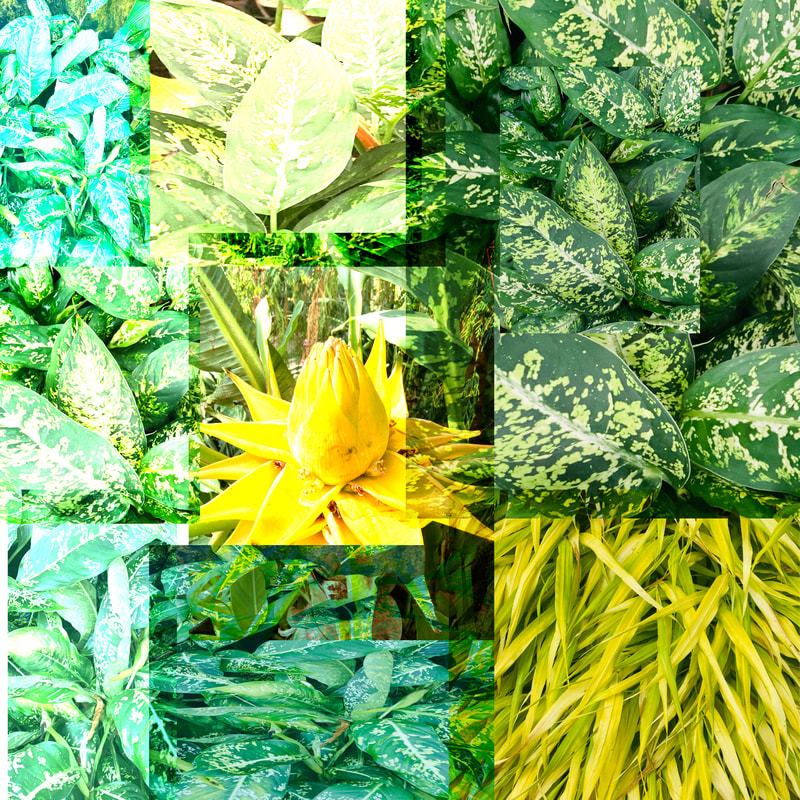
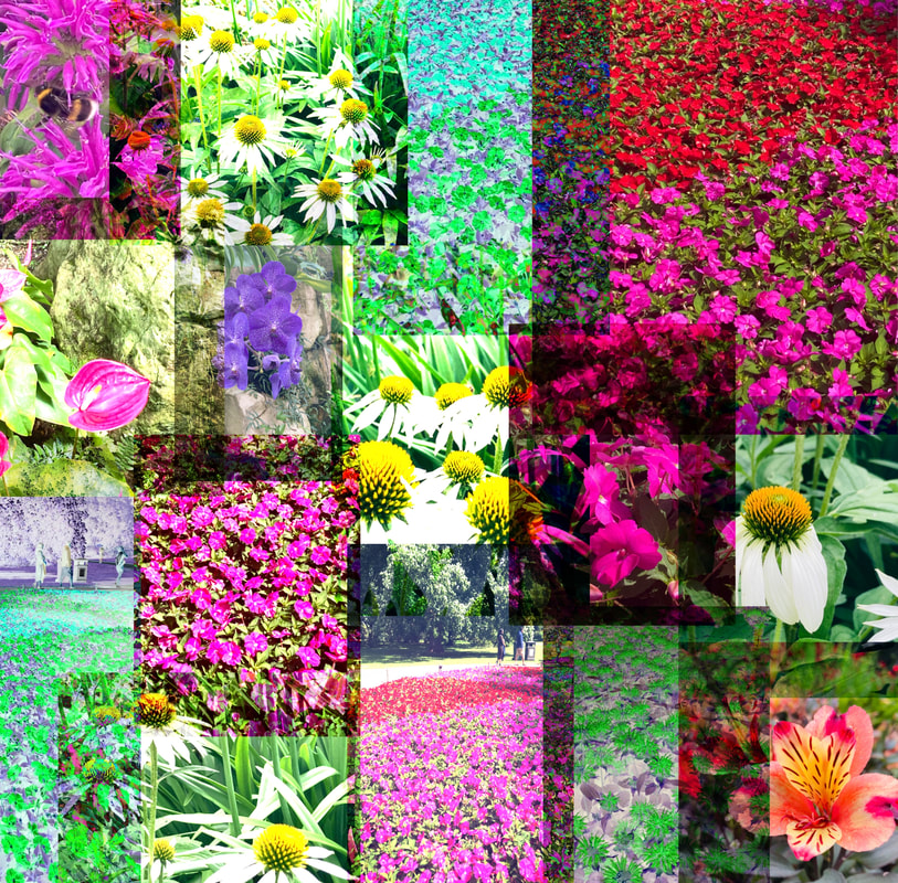
- Image 9: In this photo I wanted to focus on the patterns, textures and colours of leaves and grass. The different shades of green and yellows are highlighted and the range of dark and light are also displayed. The perspective of some of the pictures are from above looking down on it, others right next to the leaf and others further away to capture the vastness.
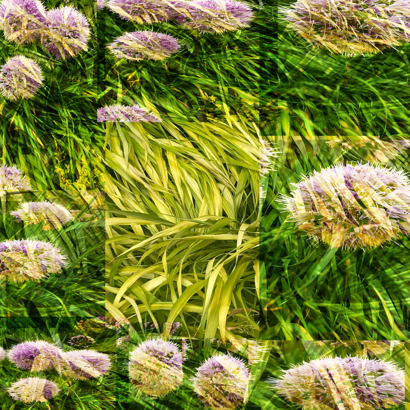
- Image 10: In this picture I included the different colours and shades on grass, making that the main subject of the photo with purple flowers surrounding it. Those images of the flowers were duplicated and overlapped multiple times.
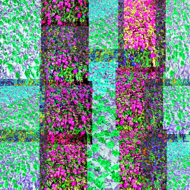
- Image 11: For this image I created columns of flowers. The purple flowers were large displays and I duplicated some of these and added new ones to create a whole line of dark purple. The next row I changed the hue on the flowers so it created a bright grey/purple and green distorted effect. You can see the pattern of petals on the flowers but as the images have been copied so many times it looks more like a design and less like flowers.
- Image 12: I used two pictures of red flowers, duplicated them four times and diagonally changed the hue so the red turned to a bright blue while the other two flowers are a light red, yellow and white. In the middle of the picture the colours merge together and create greens, purples and dark reds. I like that this image gives you more than one perspective of the same flower and allows you to see it in more than one light.
- Image 13: The blending in this image didn't work as well, I wanted the surrounding images to be of the daisies. There's lots of overlaying and the subject of the picture is a mixture of dark and light purples.
What Was the Process Behind The Images?
- I took all the pictures at different locations such as parks, the botanic gardens and kew gardens
- I uploaded all the pictures to editing apps
- I compiled all the images and blended and overlapped
What Went Well + Even Better If
WWW: A range of different designs and patterns that met my criteria for my development. The diversity in colours, lighting and angles went well and experimenting with different effects like the brightness, contrast and hue of the images was another factor that I thought developed this project well.
EBI: Some of the blending of the images have not been done smoothly and the picture cuts off at a random point. I also think next time the saturation should be turned down on some of the photos.
EBI: Some of the blending of the images have not been done smoothly and the picture cuts off at a random point. I also think next time the saturation should be turned down on some of the photos.
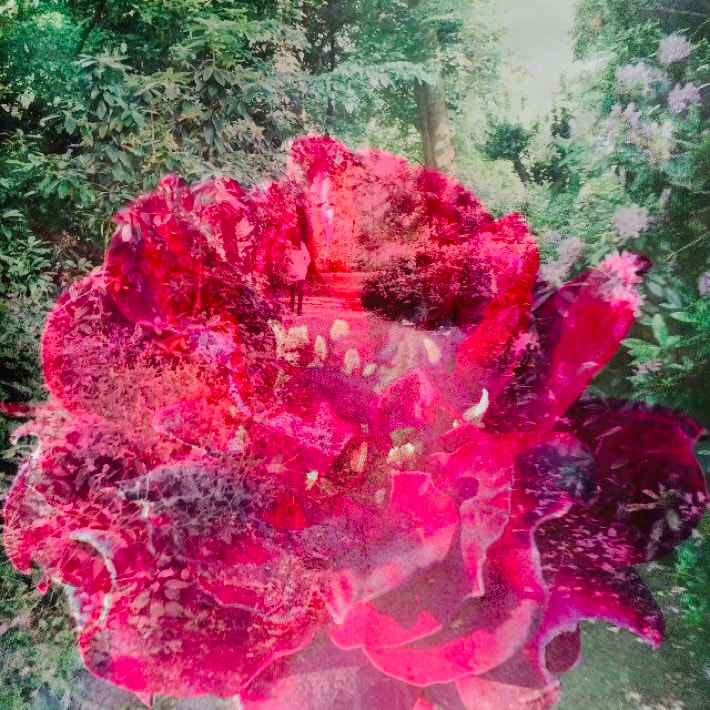
My Third Development: (Edited Response)


|


|

|
What Went Well + Even Better If
WWW: A slightly different editing approach, using different colours for the plants and using photoshop
EBI: Even though my aim was to have smoother blending it hasn't worked as well. You can still see the out lines on some of the flowers
EBI: Even though my aim was to have smoother blending it hasn't worked as well. You can still see the out lines on some of the flowers
What's My Next Development Plan?
For my next development I want to focus on grouping all the colours together and looking at textures and patterns, drawing away from flowers. To do this I will need to compile all the colours and re-edit them.
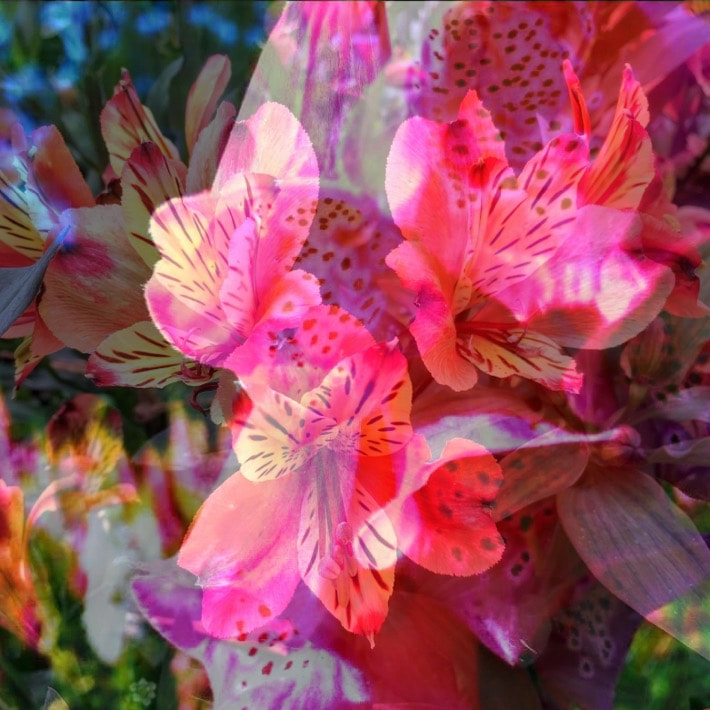
My Fourth Development: (Edited Response)
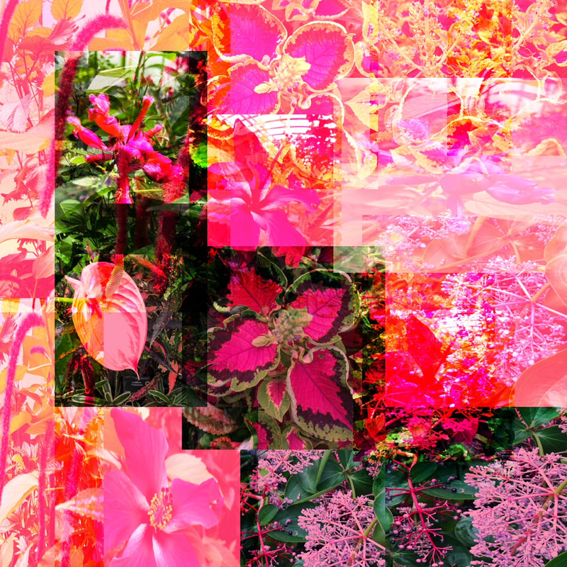
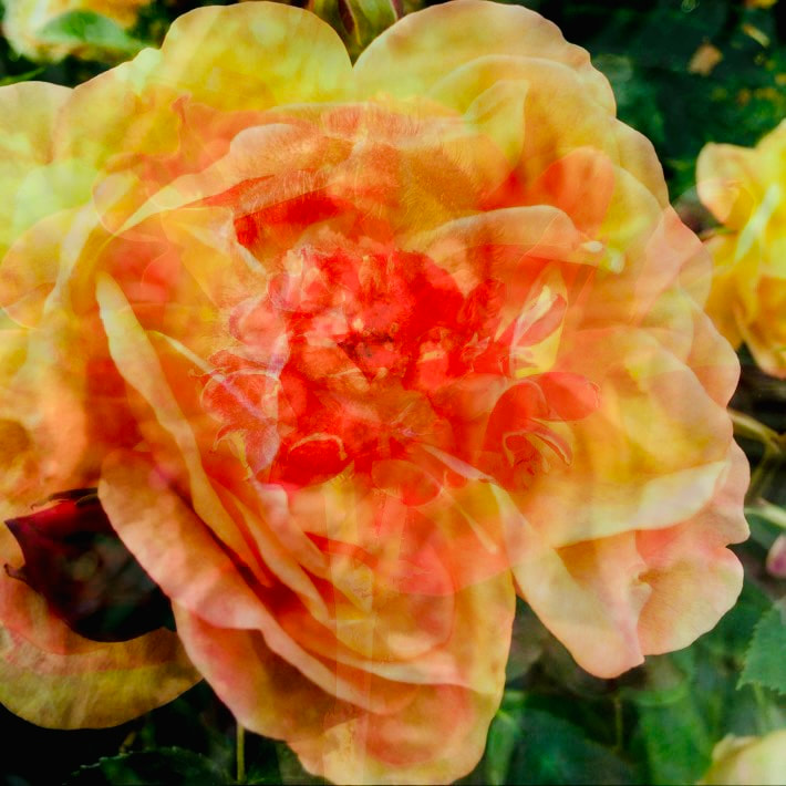
Image 1: The colour theme is pink. I've incorporated light and dark pinks, under exposure and overexposure.
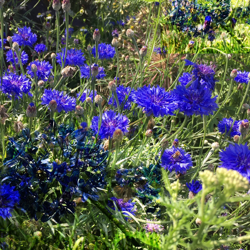
Image 2: A bunch of blue flowers have been compiled together. I think this picture came out well because you can't see the outlines of the overlapping of images and the blending looks smooth.
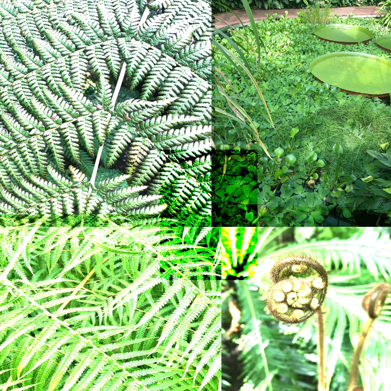
Image 3: I wanted to capture all the different shades and textures of green there are in nature, dark and light.
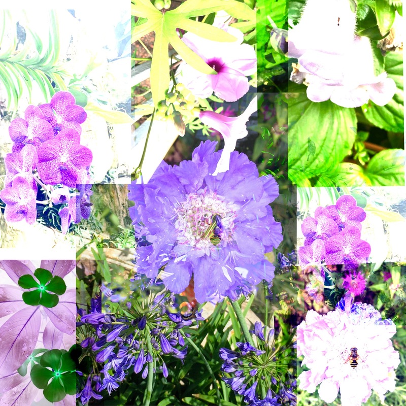
Image 4: I've included all the purple flowers and created the effect of a collage.

Image 5: I didn't have many orange pictures so I duplicated the couple that I did and covered them around the border of the photo.
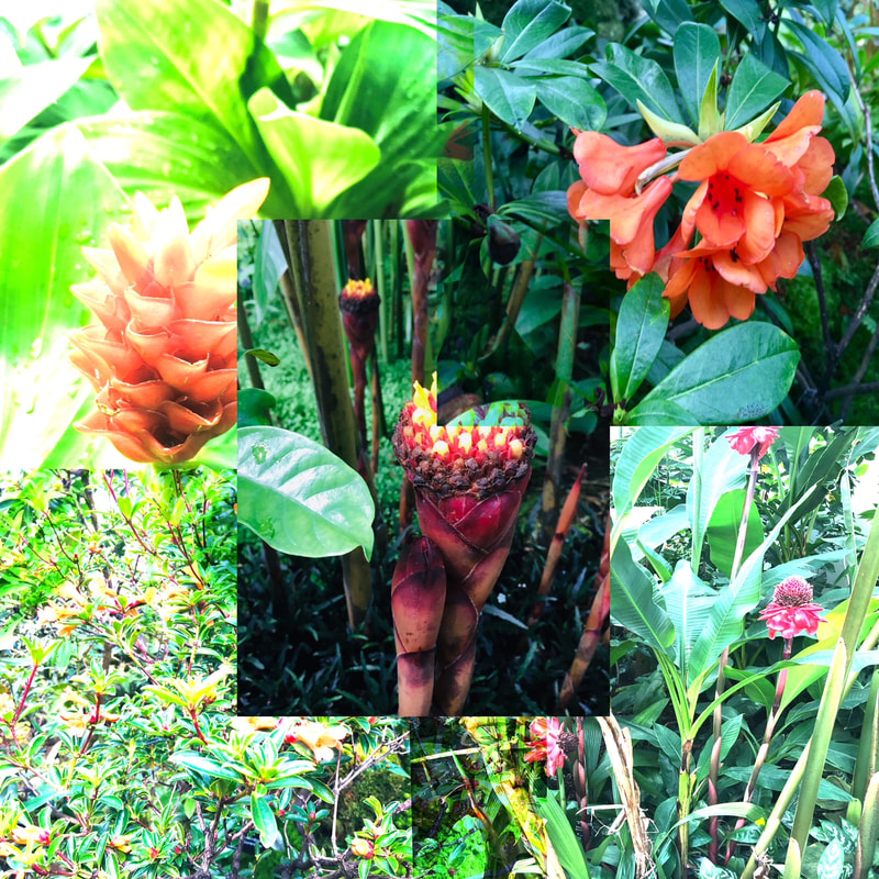
Image 6: This picture was more of a draft, it looks like my earlier developments because even though I was attempting an orange theme it didn't turn out with one set colour

Image 7: The blending in this picture hasn't turned out as well but I tried creating a layering effect to the red flower.
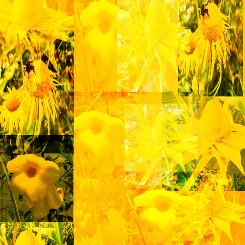
Image 8: Focusing on yellows

Image 9: This is my favourite image from this development. I have duplicated the same flower twice and zoomed in on the patterns and colours within the plant
What Went Well + Even Better If
WWW: I have focused on colour and creating collages that are more organized based on their colours and design
EBI: If I had edited the images at school I could have used photoshop to blend and edit the pictures more smoothly instead of seeing the outlines
EBI: If I had edited the images at school I could have used photoshop to blend and edit the pictures more smoothly instead of seeing the outlines
What's My Next Development Plan?
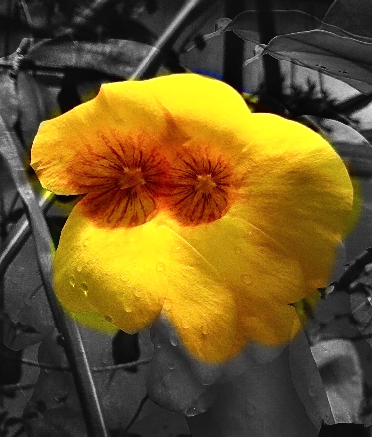
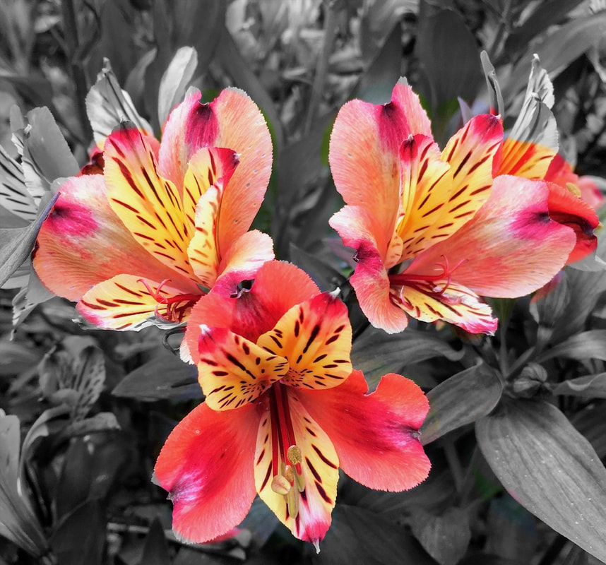
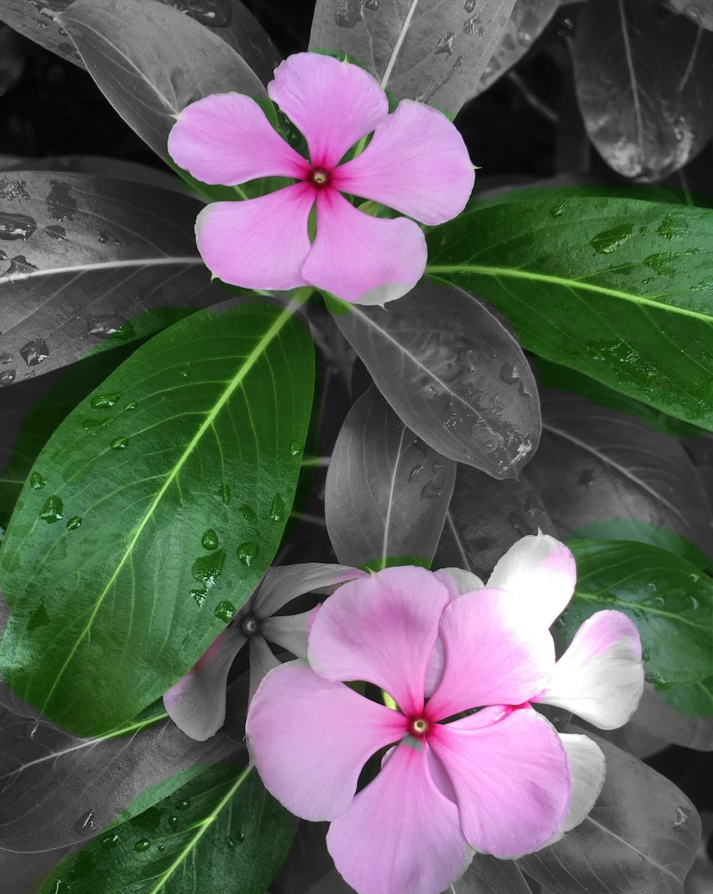
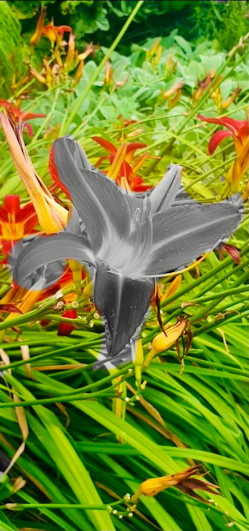
I want to start focusing more on colour. To do this I'll be taking photos with selective colour over a black and white background to enhance the visuals.
My Fifth Development: Edited Response

|


|
What Went Well + Even Better If
WWW: I've used colour only in the main subject of the picture and sometimes only colour in the background of the picture
EBI: Some of the pictures you can see an outline of colour in them when it's meant to be grey, but it was hard to create a perfect outline without overlapping in a few photos
EBI: Some of the pictures you can see an outline of colour in them when it's meant to be grey, but it was hard to create a perfect outline without overlapping in a few photos
What's My Next Development Plan?
For my last development I want to combine all the flower pictures, bring back all the colour and blend all the pictures to create a Mika Ninagawa style collage.
FINAL RESPONSE
My Sixth Development: Edited Response


|


|
What Was The Process Behind the Images?
1. Upload the first image on to a blank canvas
2. Upload the second or third image over it
3. Overlay the images
4. Align them to be in the same frame
5. Changed the opacity level
6. Increased the saturation and contrast
2. Upload the second or third image over it
3. Overlay the images
4. Align them to be in the same frame
5. Changed the opacity level
6. Increased the saturation and contrast
What Went Well + Even better If
WWW: I finally learnt how to overlap the images on photoshop and created a smooth blending without seeing the outlines. I think it adds to how I wanted the pictures to look like a print or a design and less of a collage
EBI: Take more variety of images instead of flowers include other elements of nature
EBI: Take more variety of images instead of flowers include other elements of nature
What Composition Techniques Have Been Used?
- Layering: Has been the main theme of this development project and is included in all the later developed photoshoots with photoshop
- Rule Of Thirds: Has not been used in this project
- Balance: Sometimes I have tried using this technique but not too much
- Triangles: Have not been featured in this project
Extended Response
Seventh Development
What Is My Photoshoot Plan?
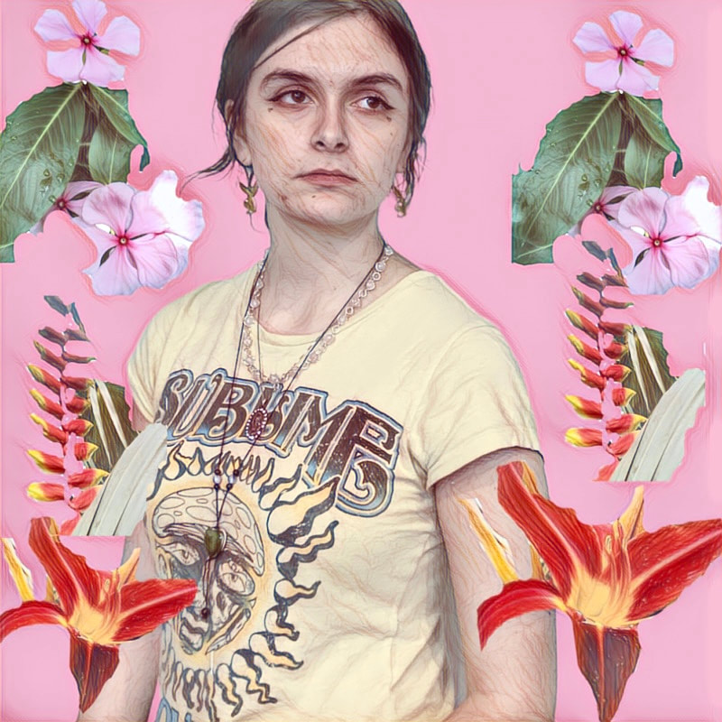
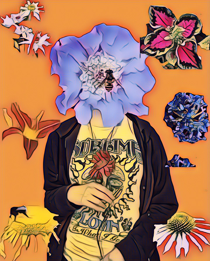
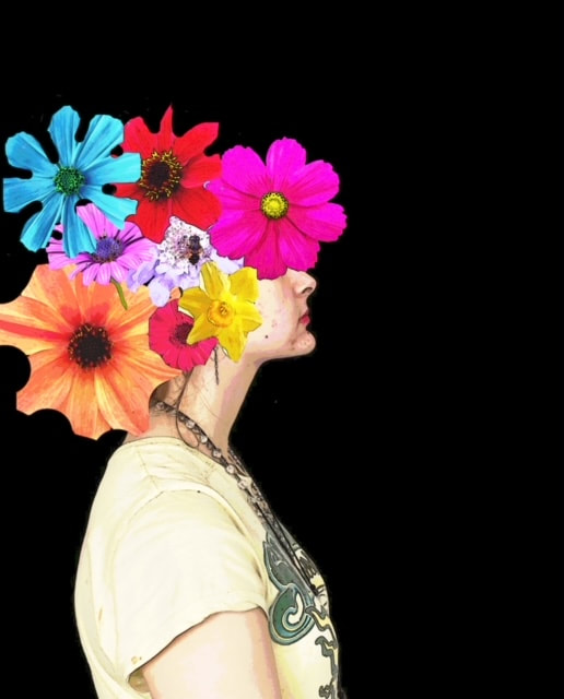
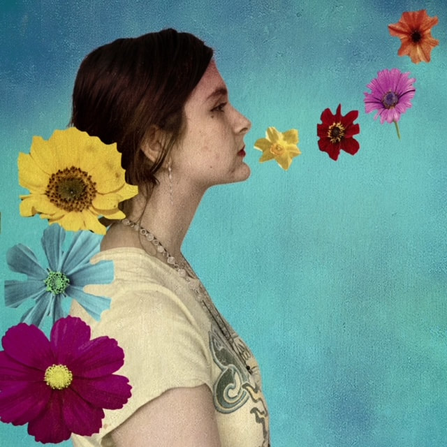
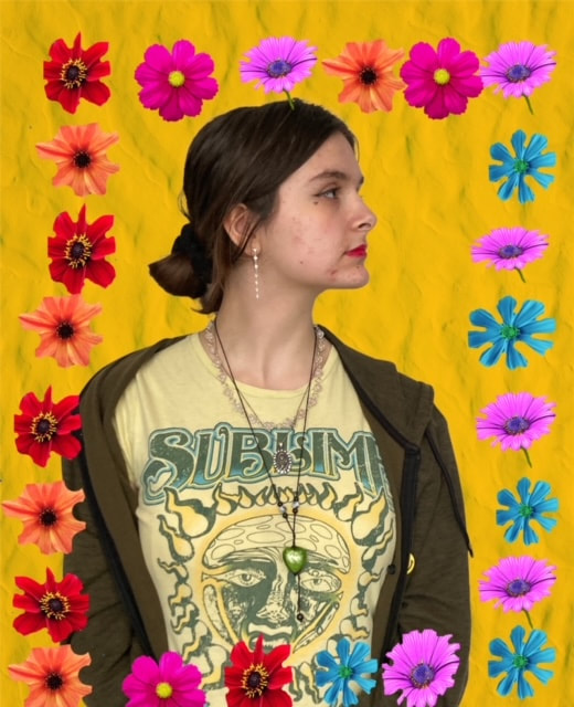
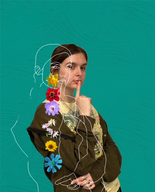
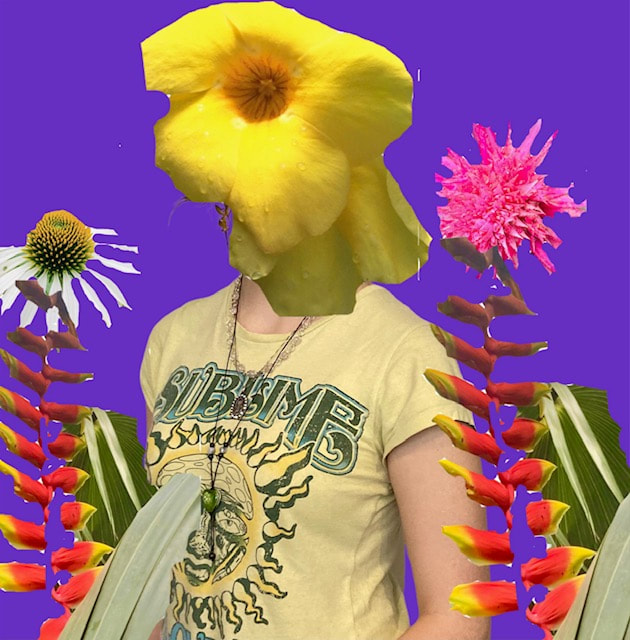
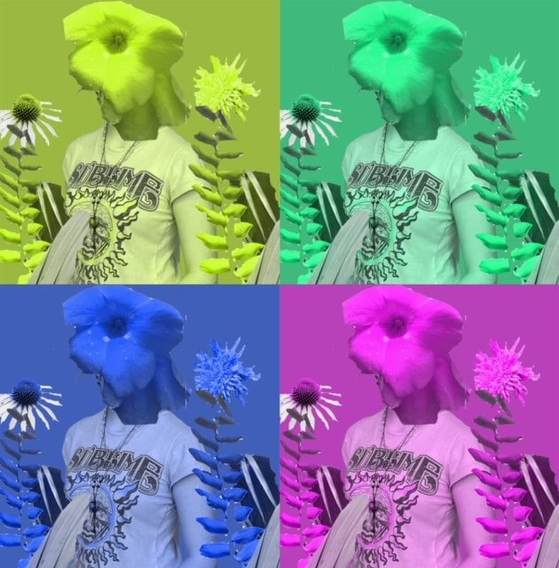
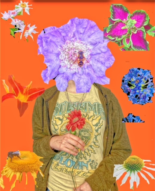
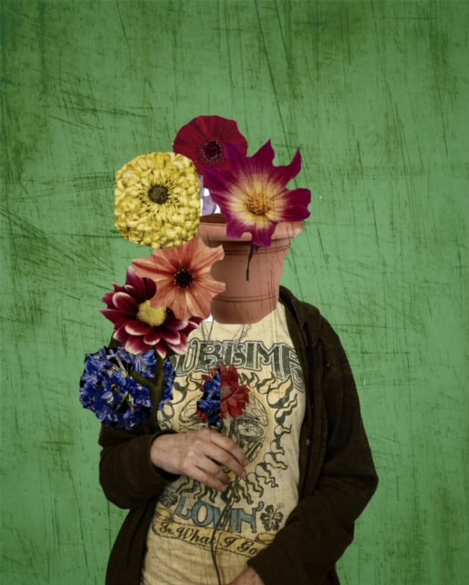
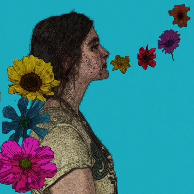
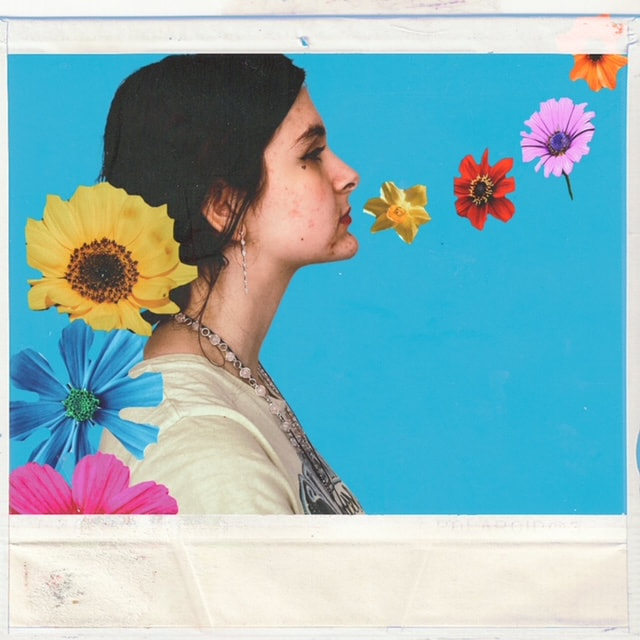
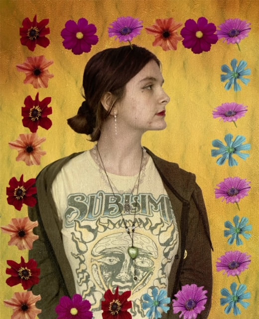
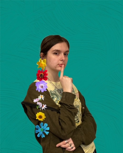
To develop on my ideas I have decided to take inspiration from some pictures on Pintrest and use a model to recreate some poses. My plan is to edit the background and include old pictures of flowers I've taken to distort the face of the model and focus on the environment element of the project.
Inspiration board
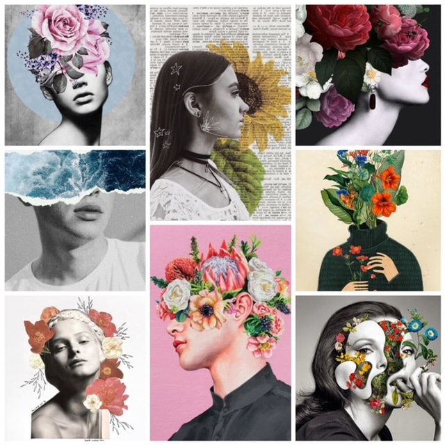
|
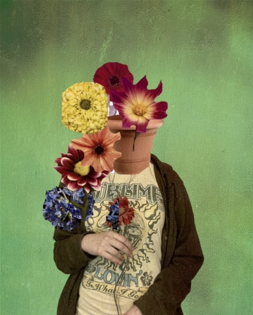
I especially like the black and white photoshoot as the colour of the flowers of purple is particularly bold. Another photo that I picked out was the picture in the cream background as it distorts the face and uses the body to act as a plant pot which holds the flowers. The vintage style of the newspaper and sunflower in the background of the girl stood out to me alongside the use of the sea running across the upper part of the models face which I thought was another creative method of distracting the viewer from what the person looks like and drawing attention to the way the face has been manipulated and changed in a light we're not familiar with seeing.
|
What Will I Need For This Photoshoot?
- A model
- Flower pictures
- An outdoor setting
- A plain background
- A newspaper
- Photoshop and other editing apps
- Strong lighting
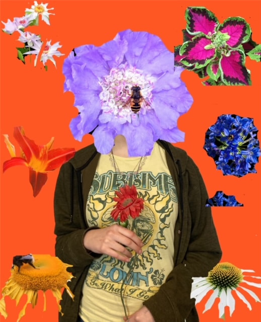
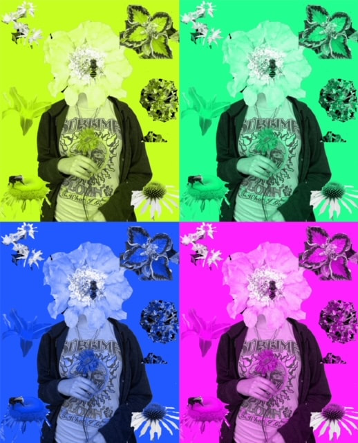
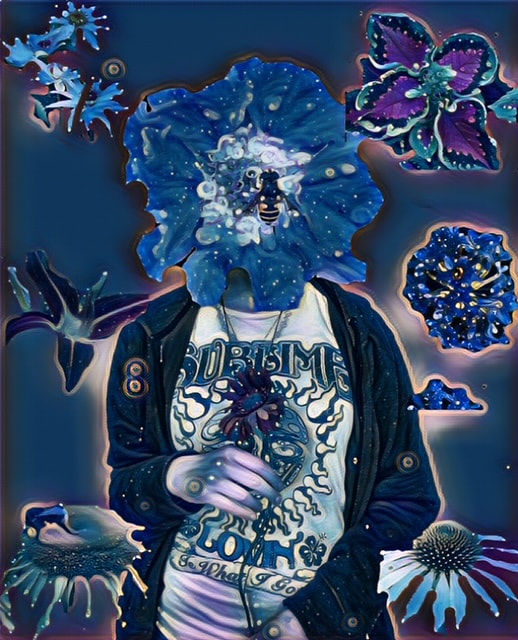
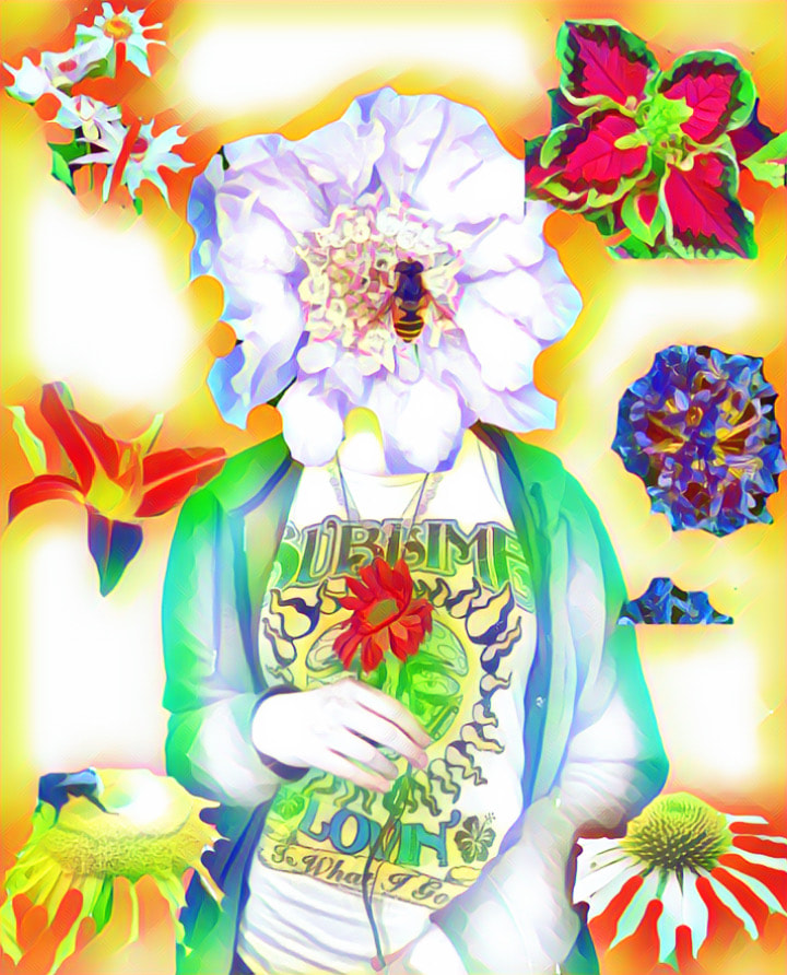
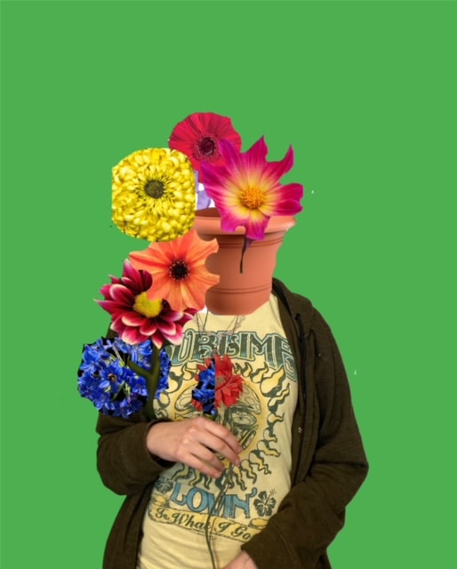
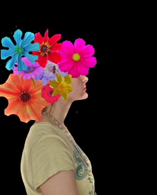
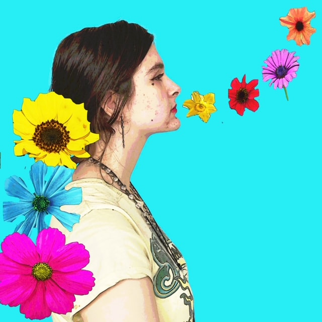
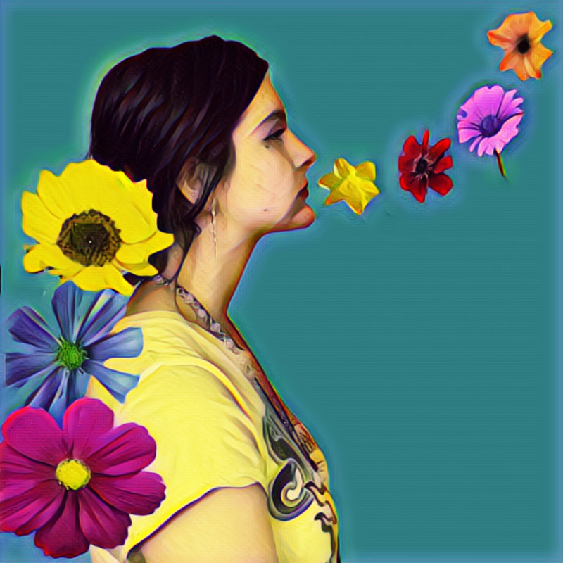
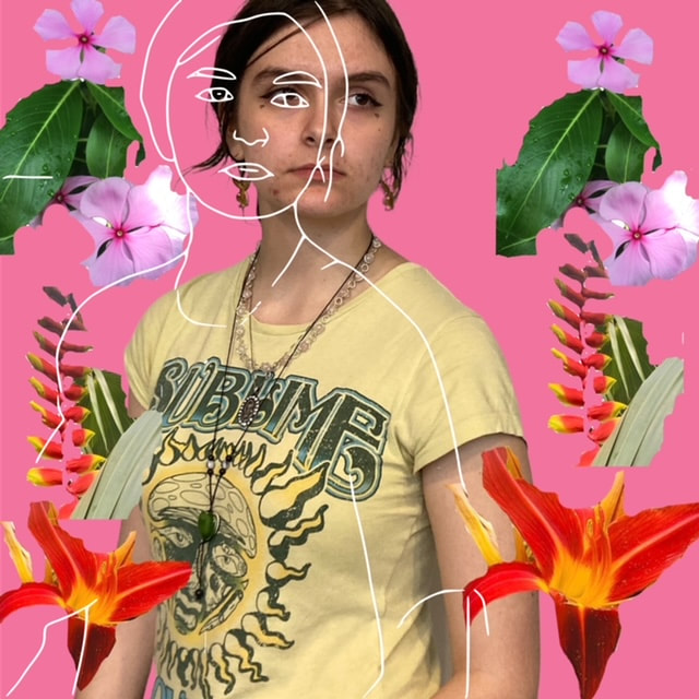
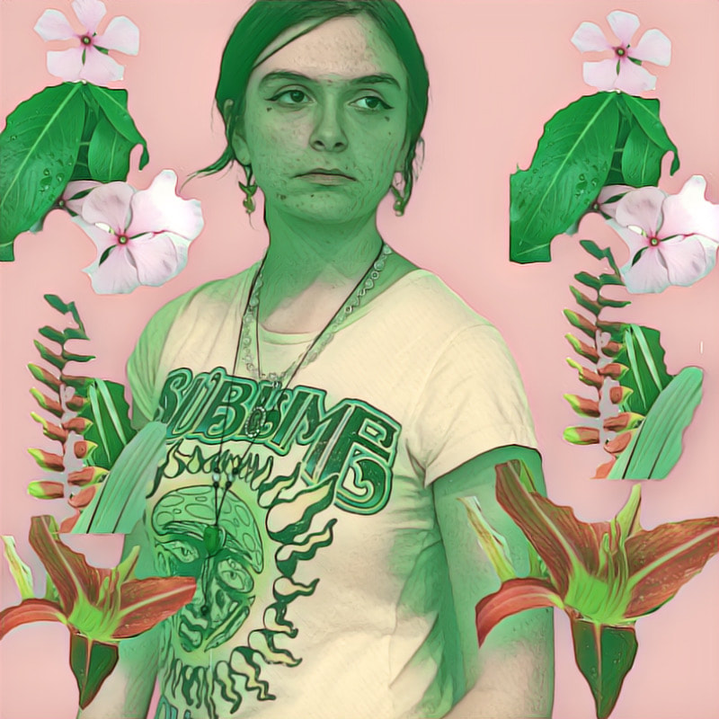
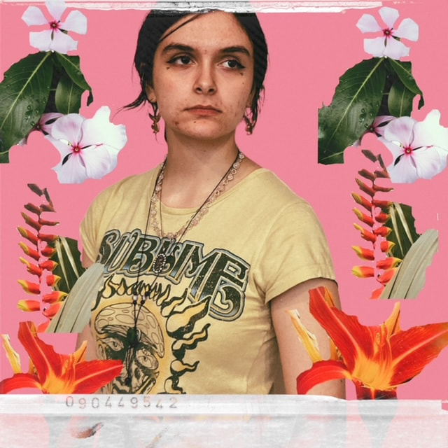
My Response: Unedited
Individual Flower Pictures
My Response: Edited


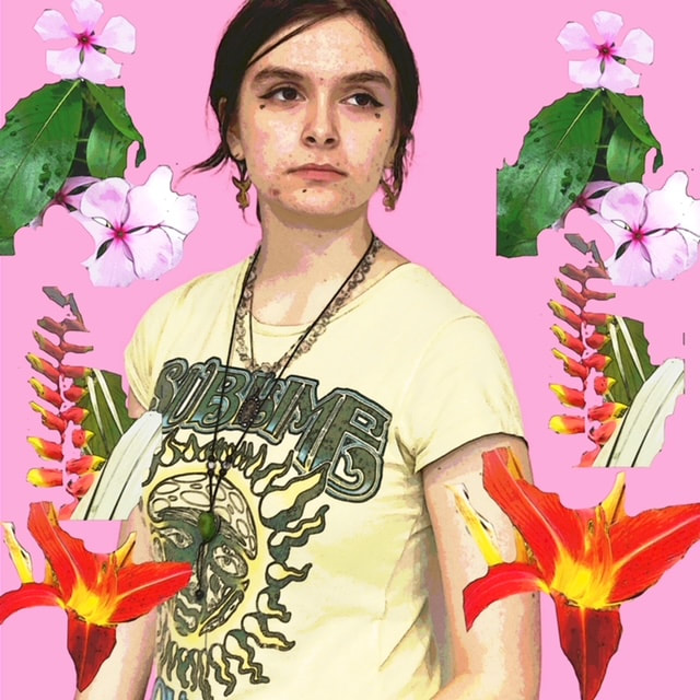
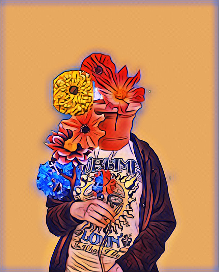

|
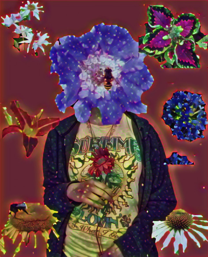
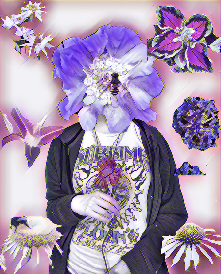

|
What Was The Process Behind The Images?
1. Take the original pictures of my model in front of a plain background
2. Edit them briefly for changes like brightness and contrast
3. Remove the background and replace it with a new colour
4. Cut out individual pictures of flowers and remove all the background so just the flower is visible
5. Edit the pictures of flowers and the plant pot onto the picture of my model and rearrange the flowers
What Went Well + Even Better If
WWW: I have replicated some of the pictures from the inspiration board, experimented with different filters and used flowers from both the internet and pictures I've taken myself
EBI: Cut the pictures of the flowers out neater around the edges so no rubbing out can still be seen.
EBI: Cut the pictures of the flowers out neater around the edges so no rubbing out can still be seen.
How Have I Developed My Photoshoot?
My photoshoot has developed from the last because i've added a person and distorted their face so that the flowers and nature are the central focus of the photos. Instead of just backgrounds other props have been used and more editing has gone into the process of these pictures. They have also improved with the style and experimenting on different colours and backgrounds and ways of featuring nature into the pictures.
8th Response
What Is My Photoshoot Plan?
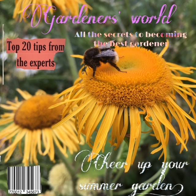
My plan is to recreate a magazine cover of gardens, home and lifestyle to include flowers and other backgrounds of old buildings. In order to achieve this I'll be using photoshop and other editing apps to create the effect of a magazine cover.
Inspiration Board

|
I have included magazine covers and noticed that the front pages are always vibrant and neon coloured which makes for an attractive cover that a lot of people will be drawn into reading. This also reminded me of something similar to Mika Ninagawa as her prints were bright and colourful in the same way these covers are attention-catching. I want to create a title and background that has the same striking colours and attention to detail in the patterns of the flowers.
|
What Will I Need For This Photoshoot?
- Lots of flower pictures
- Old building pictures
- Photoshop and other editing apps to create the effect of a magazine cover
My Response: Edited


|

|
What Was The Process Behind The Images?
1. Take the individual pictures of flowers
2. Get ideas from real magazine covers
3. Edit the pictures
2. Get ideas from real magazine covers
3. Edit the pictures
What Went Well + Even Better If
WWW: The different ideas for magazine title names and the range of quotes and phrases used, I included new flower pictures and some older ones to create te background. I like the certain elements of the covers and the details like the bar code
EBI: Some of the cutting around certain words isn't as neat as it could have been
EBI: Some of the cutting around certain words isn't as neat as it could have been
How Have I Developed My Photoshoot?
The idea of a magazine cover links to Mika Ninagawa's involvement with magazines such as vogue. Since my last photoshoot I have elevated the idea from a single person with no background context in the picture. This time I have drawn inspiration from real photoshoots of nature and lifestyle magazines that helped me have more guidance when decorating and producing the pictures.
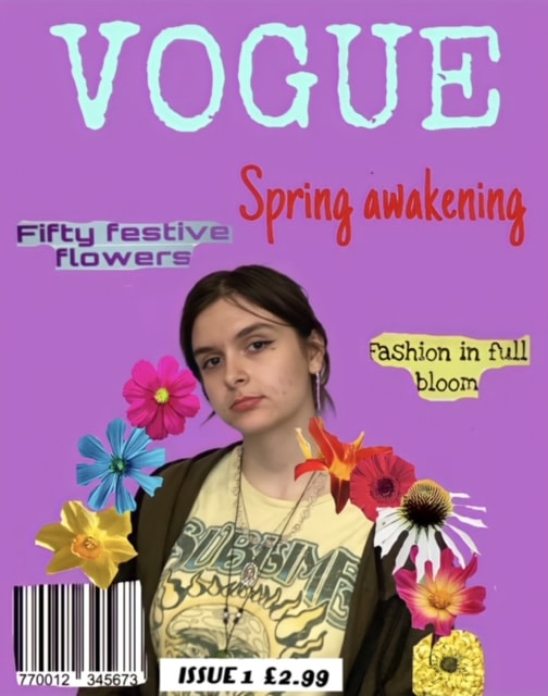
9th Response
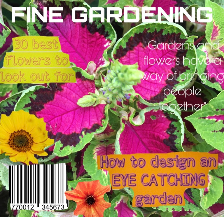
What Is My Photoshoot Plan?
My plan is to recreate some vogue magazine cover shoots as well as my own style using flowers and adapting to a similar style of photography that has been used in previous photoshoots with famous celebrities.
Inspiration Board
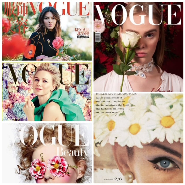
|
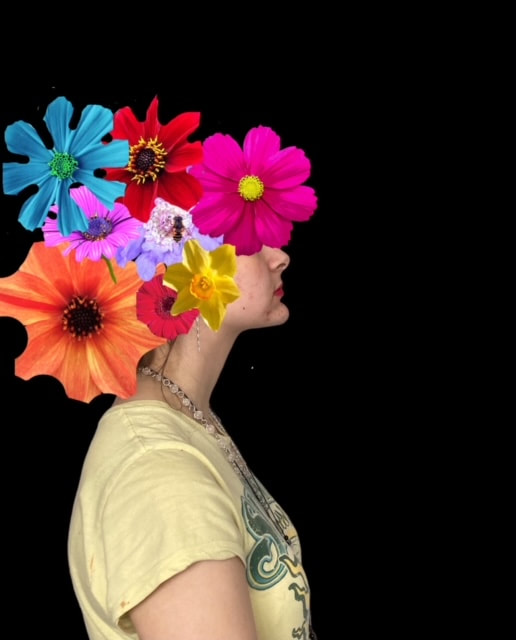
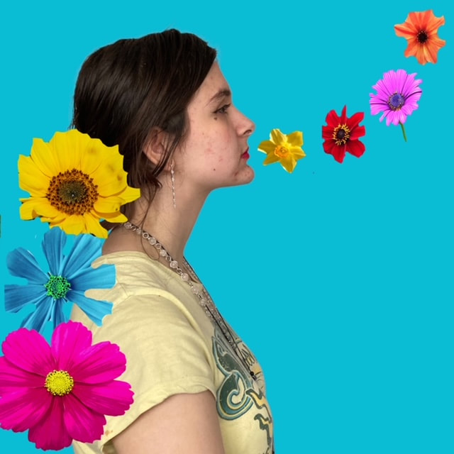
For this collage I combined some of my favourite magazine photoshoot front covers and have tried adapting a similar style to my photoshoots. I like how some covers make the flowers the main subject of the photograph while others use the flowers as a background feature to accentuate the model. The range of colour schemes that can sometimes reflect a time of year, a summer edition, autumn edition or generally a spring edition. While sometimes the model is wearing flowers as an accessory it is used as a background in other photos. The flowers sometimes distort the models face in an every day way that we see people, by replacing their eyes which is an attribute of these covers I'd like to replicate in my own.
|
What Will I Need For This Photoshoot?
- A model
- Flower pictures
- An editing app and photoshop to create the impression of a magazine cover
My Response

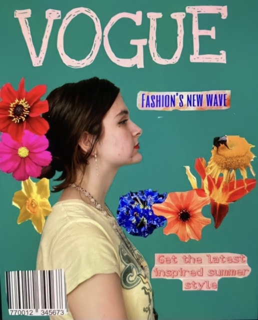
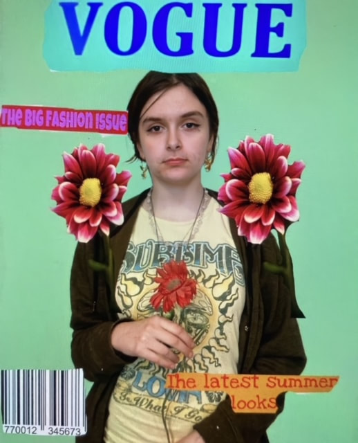
|
|
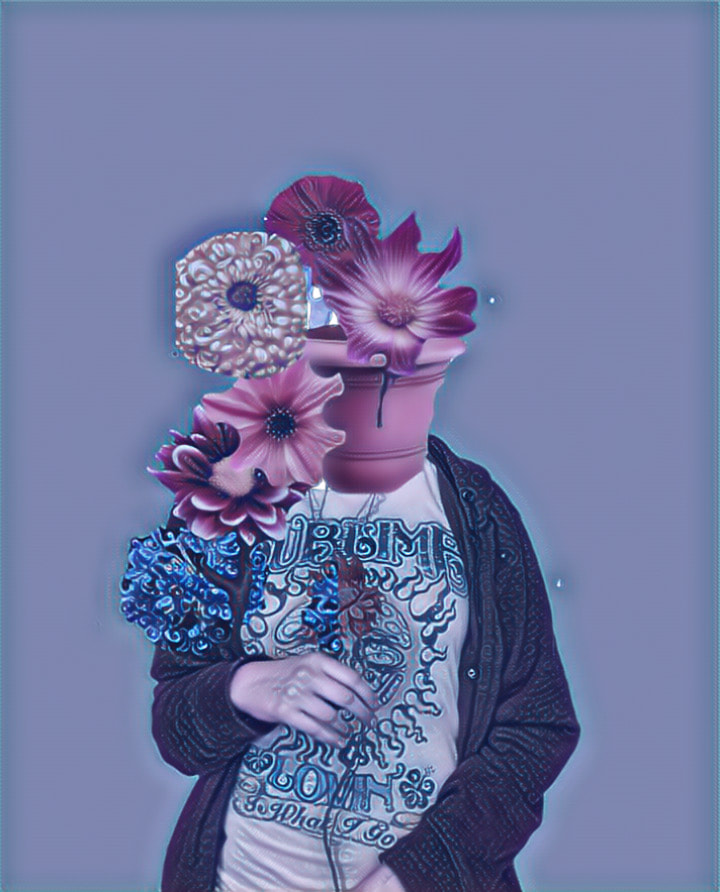
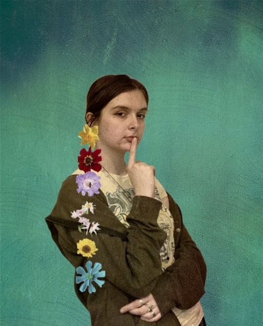
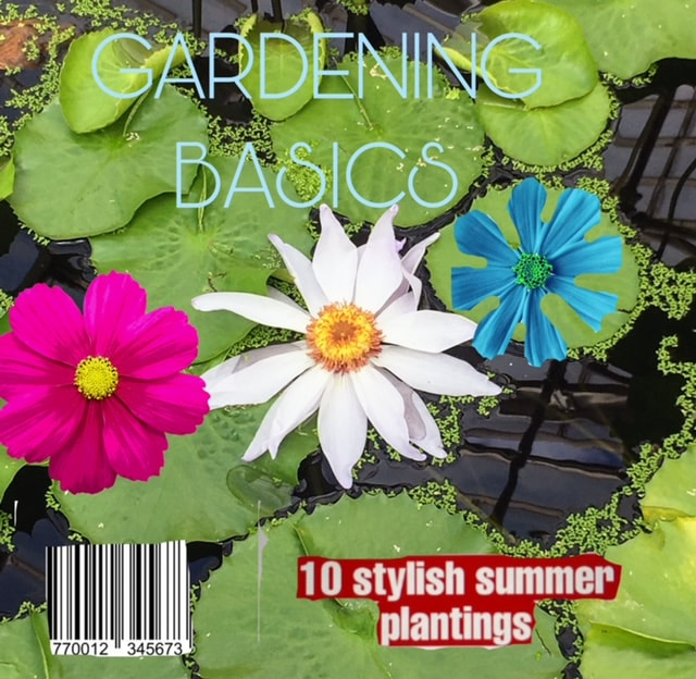
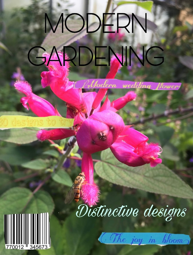
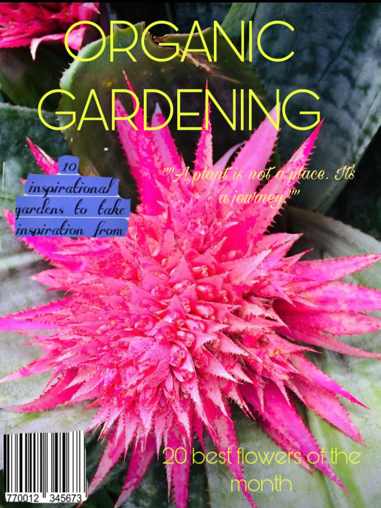
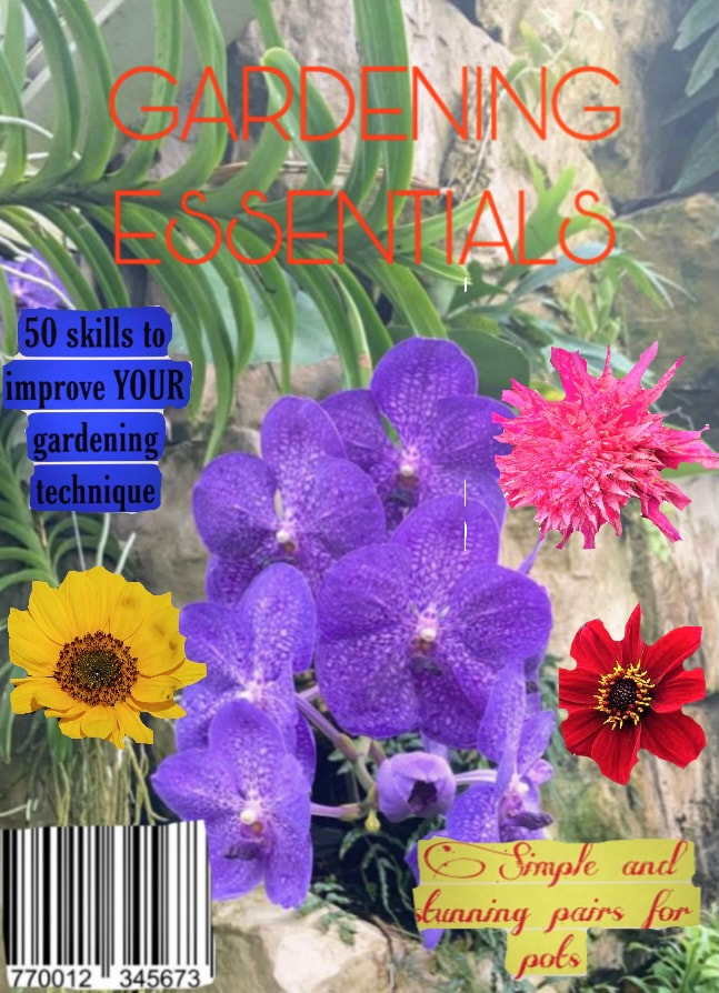
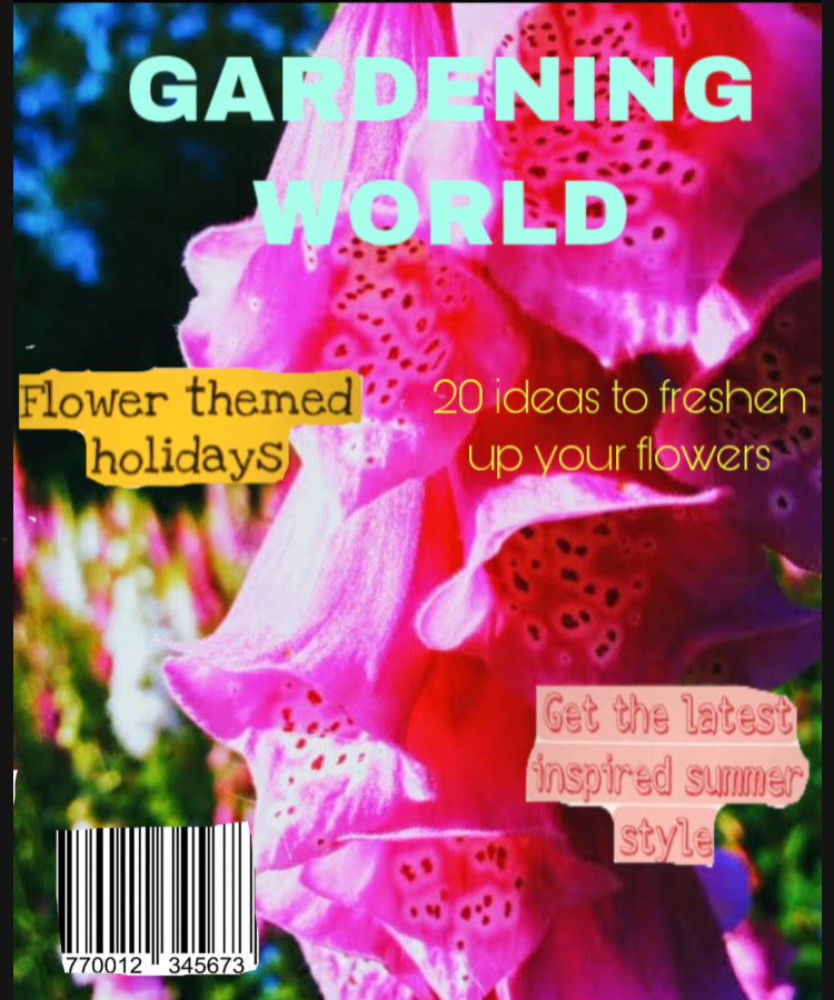
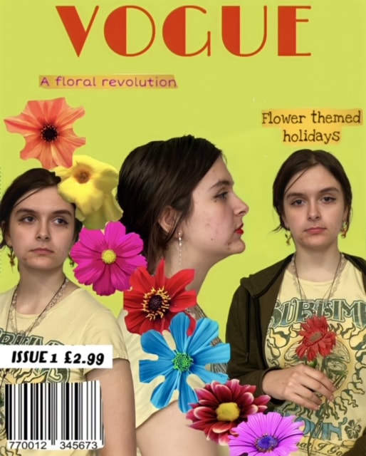
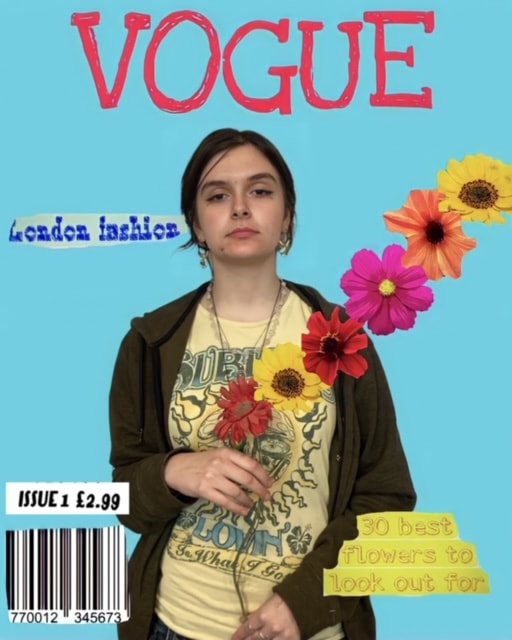
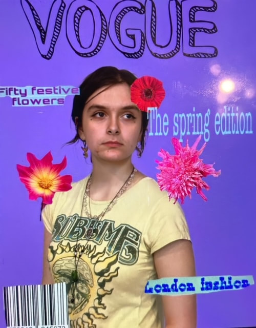
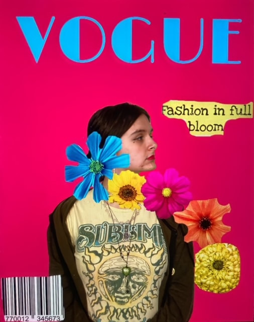
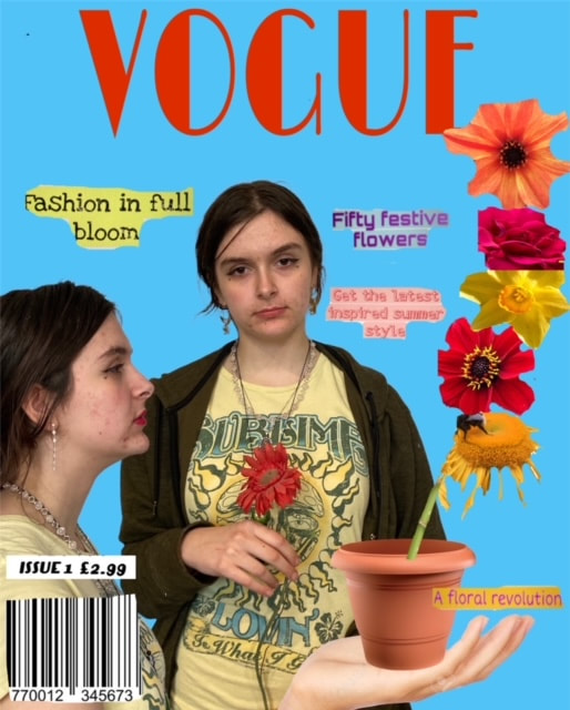
Final Piece
*These are my favourite covers from the above photoshoot

|

|

Why Have I Chosen These Images For My Final Piece?
I chose these three covers because I feel that the use of the hand holding the plant pot with the flowers and having multiple of the same person duplicated on the cover was my most innovative and creative idea. I particularly like the colour choices and think the blues and red compliment each other well. Although the editing process took the most time, it was my favourite image of all the covers. I found that the purple cover was a unique choice for a magazine cover, while the yellow cover was bright and engaging.
What Was The Process Behind The Images?
1. I used the pictures of the model to remove the backdrop and add my own
2. The second stage was using flowers from previous photoshoots and taking new ones and then removing the background to get the flowers left on their own
3. Place the cut out flower images over the template of the model and plain background
4. Find pictures of magazine barcodes and use other quotes and phrases that magazines use
5. Cut the background out and add them to the cover
What Went Well + Even Better If
WWW: A range of different colours and fonts have been used to create different styles of covers.
EBI: The cutting out of some images haven't been fully cut out and the background is still visible which makes
EBI: The cutting out of some images haven't been fully cut out and the background is still visible which makes
How Have I Developed My Photoshoot?
I have incorporated more than one of the model in the picture, used flowers from new and old photoshoots, been inspired by both gardening magaines as well as vogue and other fashion magazines. My combining all of this together I have developed my photoshoots since the first few of just taking individual photos and combining them together to creating my version of magazine covers with flowers and how people model the flowers as well as it being a background feature of the photos.
Evaluation: Environment Project In Conclusion
The photographer that inspired me from the start was Mika Ninagawa and her flower images. I found her graphic designs and still life her most intriguing pieces and was interested in her career as a commercial photographer for Japanese fashion publications, including editorials for magazines such as Vogue. I learnt a lot about using photoshop, experimenting with colour, light, angles and patterns in nature. Furthermore I picked up some new skills using photoshop like overlapping and combining multiple pictures and other general tools on the app. Throughout this process I ended up taking a lot of trips to the park and focusing on the outdoors which helped me discover new plants and flowers I'd never seen before. If I had longer I would combine multiple images and create longer landscapes of overlaid images. The development in each project made me end up liking the final result because it included the blending and use of colours and nature I'd been wanting to work with. I like the fact that Mika Ninagawa's work had been working with the media and magazine covers which influenced the progress of my developments into taking a similar approach of designing my own covers.
